This post kinda piggybacks off yesterday’s about Pixlr and photo editing, which I always want to make one word but then I get the red squiggly line of rejection from my operating system. Anyway.
I forgot my camera Thursday but convinced my lovely husband to bring it to me in the afternoon so I could wander the school with the advancement director and take photos she could use in the capital campaign brochure. I have a lot to say about this experience, but it’s late and I am tired and my allergies have gone haywire again, so I’m going to save all that blather for a later post. I’ll have more photos to upload this weekend from this shoot anyway so there’s plenty of time for that. Suffice it to say that taking photos for someone else reminded me why I never want to be a professional photographer.
For now, I just thought I’d share a few before and afters because, well, I find them interesting. I have never, ever, been able to upload a photo without editing it first. The idea kinda scares me actually. I always see what could be better about it no matter how good the shot is initially (which is what SOOC means – straight out of the camera). When I only had a little point and shoot I used editing to create the effects a better lens would have given me, like bokeh, and I’ve never backed off from there. It is true that as my skill and equipment have improved I’ve learned to make do with less, but even the simplest of shots can benefit from some fine-tuning.
I really wanted to point out to my friend (the advancement director) how much better a photo could look with a little work, because of conversations we had while snapping photos about just that subject, and when I sent these before and afters to her, she really couldn’t see what the big deal was. Without getting too much into it now, I’ll just say it is a big deal to me (in an I really enjoy the editing part of the photo process way, not an I will never speak to you again if you suggest SOOC photos are fine) and when it comes to editing I’ll leave no stone unturned to make the photo just how I want it, no matter how close to perfect I think it might be – but I never think an original photo I take is perfect.
So here’s the first example. She really wanted a shot of just the lion’s head against the sky, but there was no way to do it without getting something in the background, unless I was going to shoot right up the lion’s nose.
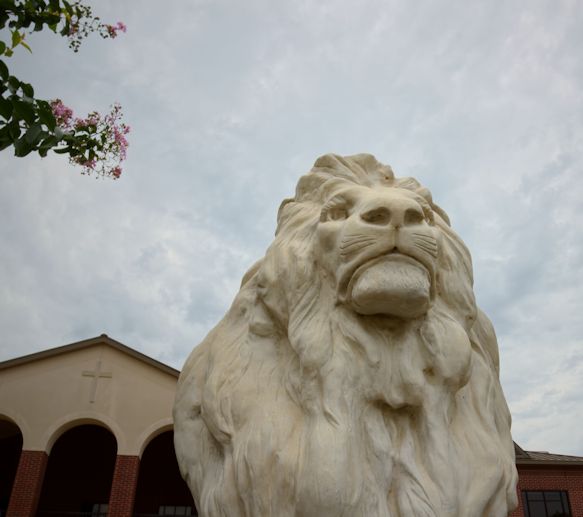
The sky was really cloudy Thursday and kinda wimpy-looking, and the edge of that crepe myrtle stood out in a bad way. I thought I could work with those clouds and emphasize the strength of the lion statue by emphasizing shadows and contrast as well, like this:
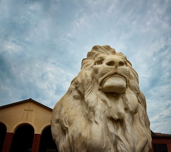
I used a clone brush to get rid of the branches, and had to add a lot of blue to the sky as well as really emphasizing the shadows, but I think the second one looks much better. I may have darkened the school a bit too much though.
Here’s another one – now this was a totally random shot I popped off while the two of us were in the hall talking with another teacher. I really like it and think it’s one of the best of the bunch:
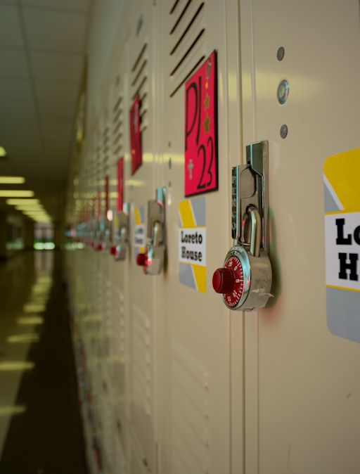
I just love the lights in the hallway and their reflection on the floor, and while the focus is on the lock instead of the sign, I still think it works. And it’s my photo so what I say goes. But, the locker had all this tape and crap on it, and I wanted the colors to pop more, so I used Paint Shop Pro and Snapseed to take care of those things.
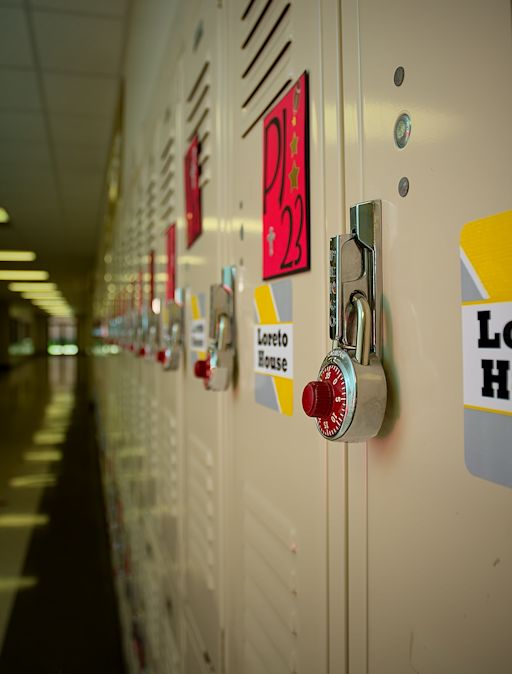
I also edited out as much of the red that was reflected in the light hitting the locks – my friend was wearing a red shirt, and in the original you can see all these little pinpricks of red in the glints of light. That’s a really picky detail but shit like that bugs me if I don’t get rid of it. Once I’ve noticed it, it must be fixed, or it will drive me batty.
I also added structure and sharpening, obviously, and brought out the red and yellow in the signs. Added some vignetting too, to draw focus towards the lock. And you can see I wasn’t able to completely get rid of the tape and other gunk on the lock but it looks much better in the second photo. I may have oversharpened or saturated the red in the locker sign, but I will try to live with that.
Here’s the one that my friend could not tell the difference at all when I showed her both of them:
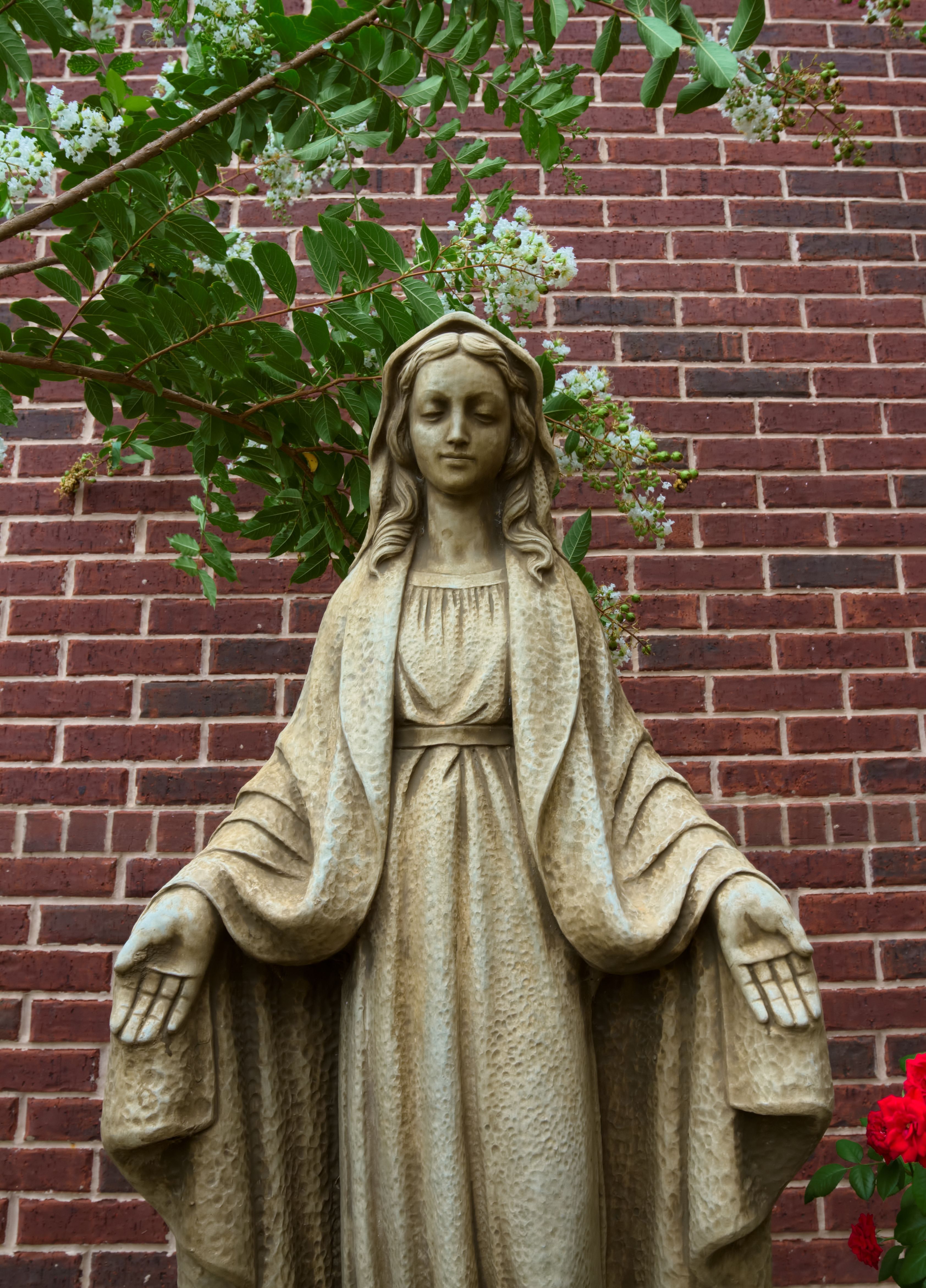
One thing about this school is that it’s fairly new, and only has one building; while it’s functional enough, it’s not very photogenic. This little garden is pretty weak; it has the Mary statue, one sad pot of roses on one side, and one lone crepe myrtle on the other; the grass around it is pretty brown right now, and the two stone benches that face Mary aren’t symmetrical. It’s a bit of a stretch to call this a “garden,” but it’s doing the best it can I suppose.
Funny thing about that crepe myrtle: it was actually nowhere near the statue, but my friend decided that to add interest to the shot she’d stand to the side and shove it over as far as she could without breaking it in half so it would be in the frame. I took a few of the photos focused out too far and you can totally see her hands pushing the tree down. It cracks me up every time I look at it, and I want to share that one along with a few other goodies I discovered (this one I took of a mannequin head that is for some reason stuck in a teacher’s window is just awesome) but I only had time to edit a few shots tonight so I’ll have to share it later).
Anyway, here’s my edit:
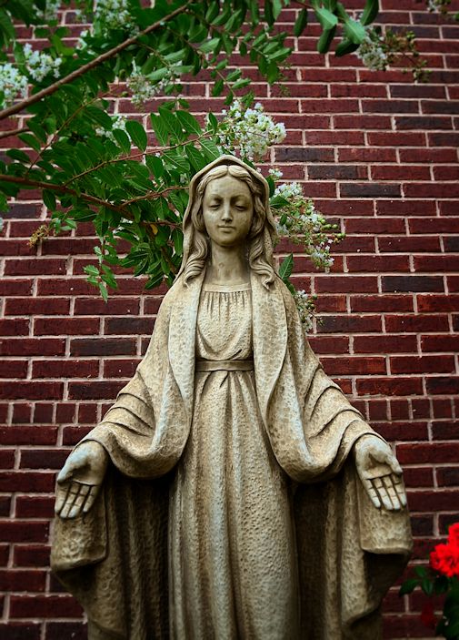
Snapseed has an awesome clarity/details feature that really sharpens photos beautifully – something that is hard to do without ruining the shot. I think you can see that really well here. I used some control points to darken the bricks and then saturate them a little for a richer color; I also wanted more contrast in tone between the bricks and the statue. I brightened up the roses in the corner because, why not; and I brightened the branches on the crepe myrtle so they would pop a little and the veining on the leaves would show up. Then I reduced those shadows on Mary’s face (especially on the right side where they were a little too dark) and actually reduced the saturation on her a bit too. Then I added the slightest vignette blur to give her a little depth, since I was using my 17-40 mm wide-angle lens so any sort of bokeh or blurring is subtle if it exists at all. I mean sure, the first photo is fine, but the second one is far more balanced, focused, and interesting. Still not a thrilling shot, but for what my friend is looking for it’s fine. And it is still fun to take a decent shot and see how much better I can make it. Looking forward to working with and sharing some more – especially the few weird ones!
