Hello everyone! It’s been another minute since my last post, but what can I say? I’ve always been completely unreliable so you should be used to that by now.
My last post was all about doll photography, and man has a lot changed since then. While I have added somewhat to my collection, my photography has not taken off like I thought it would. While on occasion taking doll pictures is fun, it has not turned out to be all that enduring as a hobby. I still do it on occasion, and I can make another post sharing more recent photos later, but what has really taken off is that rock painting I talked about a while back. It’s changed a lot since the start of it a year ago, so let’s get into it.
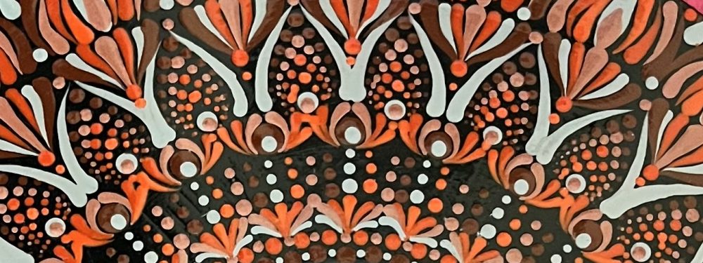
It started with buying rocks on Amazon and using acrylic pens to paint on them. I did all sort of designs and slogans and drawings, which was fun, but the first problem I encountered was the cost of continually buying rocks on Amazon. I mean, that adds up quick. So with Doug’s help I switched to making my own rocks using molds and plaster. That was a real game-changer for me, as it forced me to break my addiction to the paint pens and really start using painting tools and acrylic paints. Thus was my dot mandala obsession born.


For whatever reason, the acrylic paint pens didn’t work well on these new rocks, and although I tried many different sorts of primers and base paints to get there, it just never worked. So I decided to buy some dotting tools and acrylic paints and try my hand at making dot manadalas. None of the above are my first attempts at this, as most of them were pretty bad. I struggled with symmetry and control over my dots and swooshes, so things were pretty sloppy unless I kept things very simple, as I did in most of the ones above. But soon I encountered another problem.


Yeah, there were rocks EVERYWHERE. And yes I know, I could be selling these somewhere, but I’m not up for that at the moment. So something had to be done.


At the time, my husband was working on a craft of his own involving D&D miniatures, and he had a bunch of these wooden tiles left over. I’m not sure what kind of wood this is – it feels like balsa wood and is very light and pretty thin, but hey, they were there for the painting, so I took them on. And overall I liked being able to work on a larger space that was also flat, which helped a lot, and I was able to start refining my techniques. I think you can tell that I’m getting a bit more inventive, but symmetry and consistency are still my biggest issues. Anyway, after I blew through his square tiles, I found that Amazon also carried round ones, so that was my next step.


Some other issues I had to work through/learn were getting the right paint consistency and how to create a nice smooth surface on these tiles. They have a grain to them even though they appear and feel smooth, and without any priming the paint seeps into those tiny lines and distorts the shape of the dots as well as making it hard to smoothly manipulate paint across its surface. For a while I was using spray primers to help with that, which it did to an extent, but it was unreliable and I was dependent on the weather for when I could use it (it needs to be sprayed in a big space or outside). I also had to experiment with different brands of acrylic paint and paint thinners until I found the combination that worked for me. But I’ve pretty much got that part figured out for now. I actually really like the Crafter’s Collection paints from Hobby Lobby – we don’t have a Michaels in town so I’ve had to suppress my opinions about HL to get my materials – they are quite inexpensive at .50 for 2 ML of paint, and they have a pretty extensive palette to choose from. However, they are VERY thick which on its own leads to a ton of paint cracking, which was super frustrating for me until I did some reading and tried using paint thinner with them, which did the trick. I actually like a paint pouring medium that’s also available at Hobby Lobby (I learned the hard way that buying paints online sucks becuase they’re often old and gloopy). I do also like Americana DecoArt acrylics, but they’re a tad more expensive.
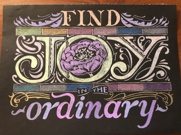
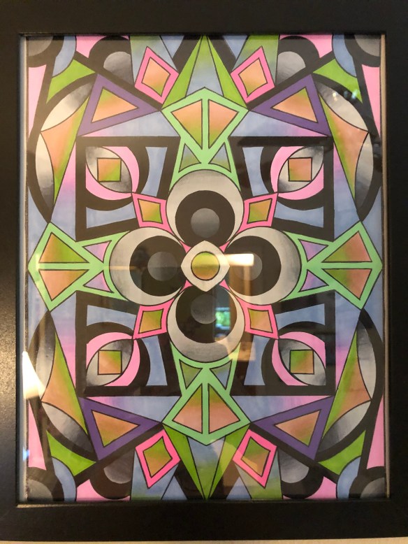
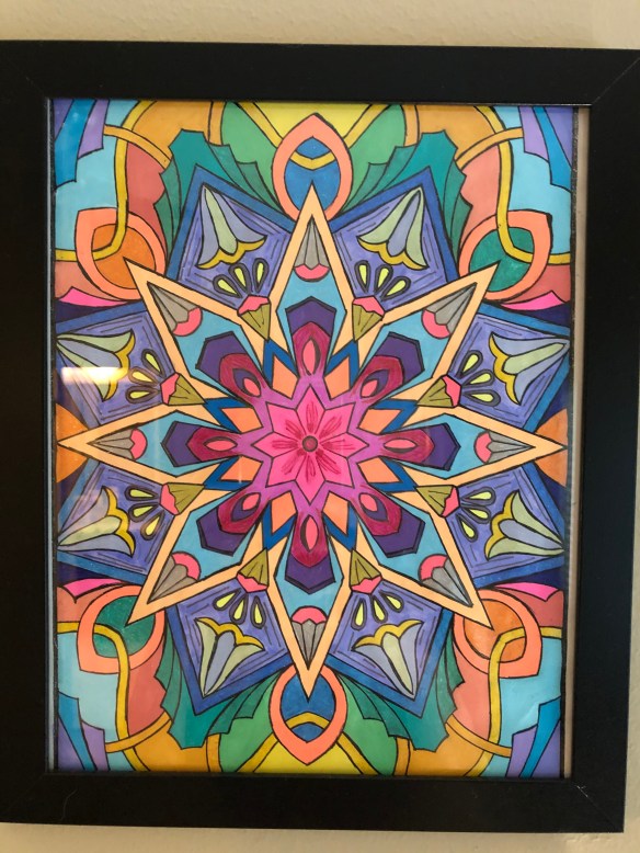
So, these tiles definitely took up less room than the rocks, but guess what? It didn’t take long for them to ALSO start taking up space in the house, so I decided to try my hand at painting mandalas on acrylic paper. My thinking was that I could paint directly onto sketchbook pages and then store those, which would certainly be a space-saver. I even found these awesome sketchbooks on Amazon that have removeable sheets you can reattach to the notebook when you’re done, which is fantastic.


For most of these, I would use the leftover paint from my previous mandala as the base color of the next piece, but I’ve since found a better system for retaining paint at the end of a session so most of the ones I do now are on black backgrounds.
This is still where I’m doing most of my work for now, EXCEPT for one additional base material I discovered via some Pinterest pictures:

Old vinyl records! You can buy fake vinyl records on Amazon and paint all the way up to the little hole in the middle, but I liked the idea of finding records with cool labels i could use as a base for creating color palettes and shapes. Unfortunately most labels are boring, but I did manage to find a few interesting ones.


Obviously I’ve taken a step backwards regarding space-saving and de-cluttering, but records are pretty fun to paint on, and at least they can be hung on a wall easily. Doug has a ton of old records, and although most of them are rare or collectible, he does have some duplicates that I’ve also painted.


Obviously there are some different approaches to these different materials; I’ve found that using chalk paint as a base is best for vinyl instead of some other primer option, but other than that the process is pretty much the same as for paper, except the surface of the vinyl is more smooth which makes dotting and swooshing really satisfying. And as I said, hanging them on a wall is as easy as hanging the center hole over a pin or a nail.

So this is how I’ve been spending my time the last few months. I’ve watched a lot of good horror movies, too, but haven’t had time to review any of them. I’d like to review Leaving DC as a reader suggested, but I haven’t watched it in a while so I need to do that first, and there’s been so much fun stuff to watch lately (Late Night with the Devil, Hell House Origins, The First Omen, etc) that I haven’t been re-watching a lot of older stuff. But I’ll get around to it eventually.