
I have a few more new shots to share, and for some reason I’ve got a lot that have two or more different edits and I can’t decide which I like best. So I’ll use you all for that, if I can. The one above, though, just got one edit and I was done, so no choosing to do there. That top is a Free People long duster that I put on backwards,and the wig has always been a favorite. It’s by Forever Young, a company that makes pretty nice costume-type wigs that you can still get away with wearing as your real hair as long as you have the right attitude, and they don’t cost very much (they average around $40). While wearing this getup, I was shooting without the softbox, so the light was a bit softer on my face, and it was a pretty straightforward and easy photo to edit; I didn’t have to do much more than sharpen and brighten things to get it how I wanted.
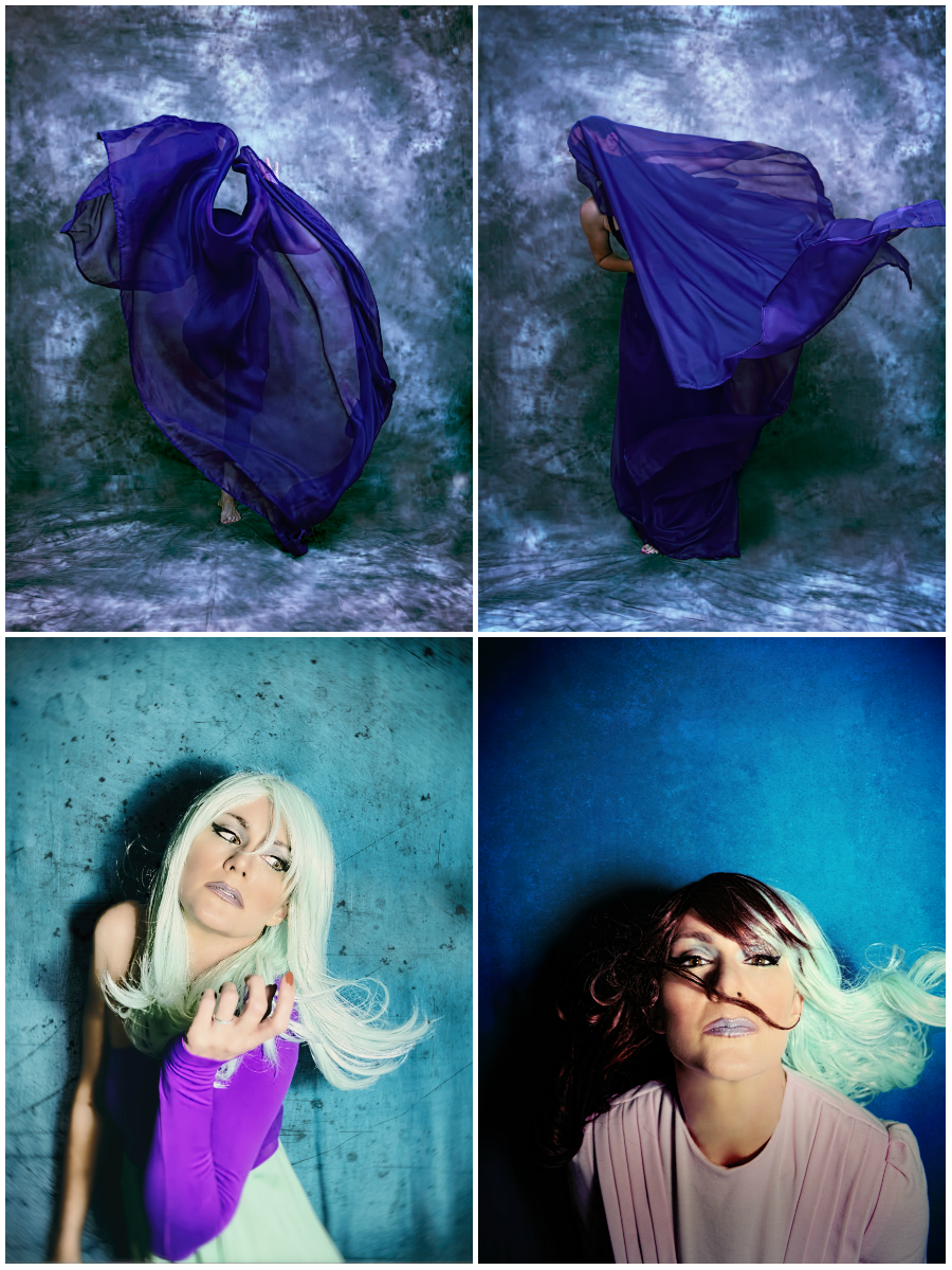
Some of these photos, though – I still can’t decide which edit I like best – like these (click to view larger):
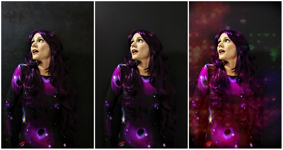
The one in the middle is the basic edit; I’m pleased with the lighting I managed to pull off here (I moved a light stand with a fluorescent bulb attached up over my head and had the external flash on my camera set pretty low) but, because of the low light it came out pretty grainy, and in processing it to remove the grain I lost a lot of clarity. Because of that, I thought I’d add some texture or an overlay to detract and/or conceal the softness (which isn’t bad, and a lot of people like soft shots like that, it’s just not my thing). I actually like all three in their own ways, but can’t decide which is the “best,” or the final one. The one on the left just has some texture added, while I used a Pixlr overlay for the one on the right. Let me know which one you like better so it can help me decide!
I also need help deciding which of these two I like better – the difference is so subtle you might not even notice it, but I can tell:
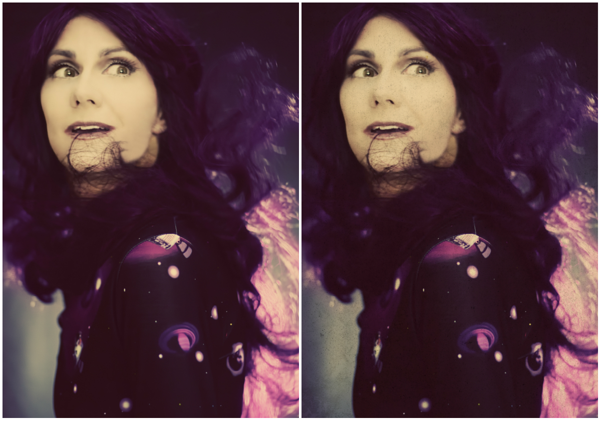
The only difference is the subtle texture on the right-hand edit. I thought the original (left) might need just a little something extra, but I don’t know – maybe it doesn’t. Does it matter? Does it add anything? Let me know what you think. Also, let me just add that there was about twice as much flyaway hair in my face than you see in the these shots; it was an absolute bitch to edit out and took a long time; eventually I ended up using some filters that added a ton of light to the face to also help reduce the visibility of not only the hair but some of the editing I did to get rid of it, which started getting sloppy. That’s why there’s such a green tone to it; it was a filter that really worked to reduce the appearance of the flyaway hairs for some reason so I went with it.
Here’s the one shot I got of the Thugmaste tee I talked about in my last post; it was actually difficult for me to get the entire slogan into a shot, because the words at either end of the tag line were disappearing in most of the shots. I ended up taking one of the few shots of my torso where the whole slogan showed and layering a better head over it. So there’s really TWO wigs showing in this shot because when I layered the different head into the shot I kept what hair was sticking out from the bottom one. I liked this one with the black and white treatment, too, but so far everyone I’ve shown has liked the color better. Thoughts?

Also, although I really liked this shot when I took it, in looking over this section of my set I realize I didn’t have the right attitude for this shirt. I should have done something with more attitude and probably a bit of humor, since as has already been pointed out to me my ability to project “thug” is pretty limited. Just standing there staring at the ceiling really isn’t what this shirt called for, which is probably why when I sent a copy to the woman who made the shirt she just said ‘thanks’ and didn’t do anything with it, LOL. Oh well. You win some you lose some.
As a closer, I’ll share the other shot I had processed that didn’t have any different edits to it; it’s another one where I experimented with a harsh light above my head and off to the side, and I like the way it worked out even though I did have the same noise issue to contend with:
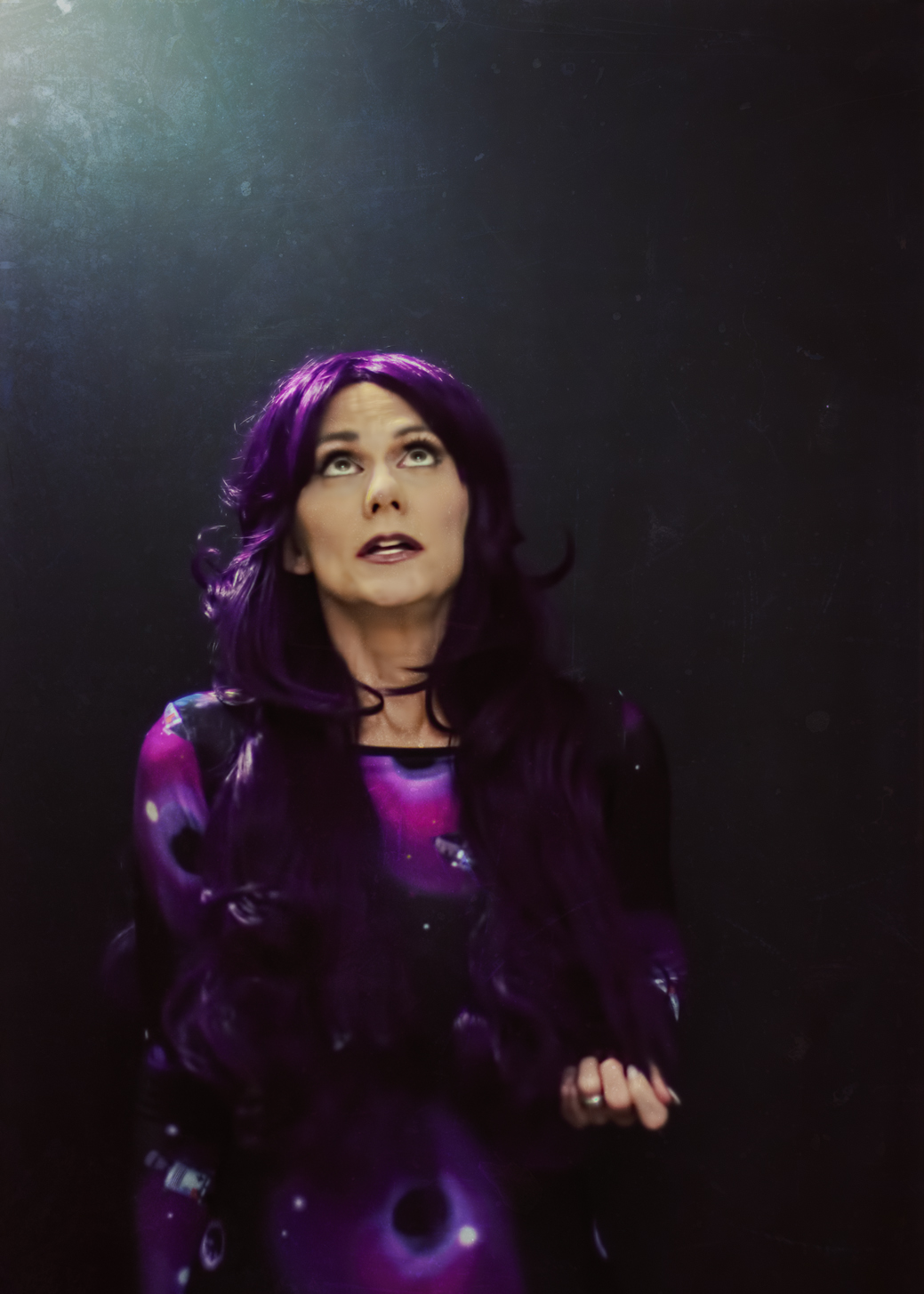
I used a RadLab texture to rough up the softness a little, but other than that just some color punches and things like that to get this where I liked it. I considered using some of Pixlr’s space-y overlays on this one, but they all detracted too much from the lighting, which I really liked and wanted to keep prominent in the shot.
That’s all I have from the new shoot for this time, but I know there’s more to come – at least of the curly wig and the space dress. The t-shirt section of the shoot I’m pretty much done with, and there was a bit at the beginning of the shoot where I tried to get close-ups of my makeup, but they ended up a little boring so I may not share any of those. However, I still have a few from the edits I’ve done of old shots to share, so I’ll throw them into a little collage for you here:

M&M,
Love the look of your first shot. I like the middle picture of the three the best. Either/or for the next two. The Thugmaste b&w is better for the mood. Looks more like a mug shot. 🙂 I’m always captivated by the flowing quality of your veil shots.
Cheers,
Russ L.
Thanks! I have a few more to edit but I started getting bored with them so I had to take a break from working with them; I was starting to get sloppy.
Analysis , analysis. I like # 1 on the triple purple . #1 again on the double. The color on:thugmaste.. The balance, no opinions. Lots of work here. Well worth the effort.
Thanks!
Out of the three I like the middle and the right one. Out of the two I see the difference and like the right one more. I also like the black/white better then the color. As for the one where your stairing up the look is like holy crap I see 👽👽👽
LOL how did you make those little aliens??
My app it’s called Emoticon its a keyboard sorta and so when your typing there is a smily face you click on that brings up a bunch I’ll send Ya a pic
Of the three shots, I prefer the middle one and also the third one as the background colours match the colour on the subject. I prefer the first of the two as I think the skin on her face looks better. I think I prefer the mono portrait shot as it feels stronger. It might have been even more powerful if she had been looking directly at the camera 🙂
Yeah, not thrilled with the t-shirt one. I will have to try that one again later. Not the right look or attitude for the sentiment.
Even the best photographers are always looking to improve. I like many of your photos 🙂
My fav was the third purple one, I can’t see the difference, I like the black and white and the platinum hair is fab. 😊
Thanks Charlotte! I am really enjoying editing this set.