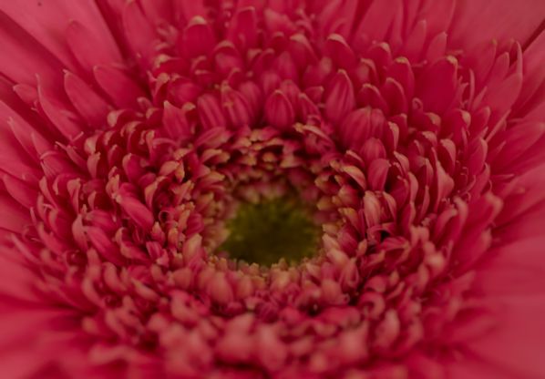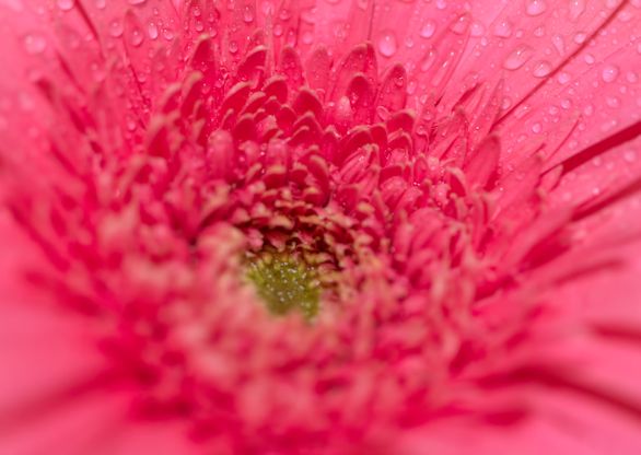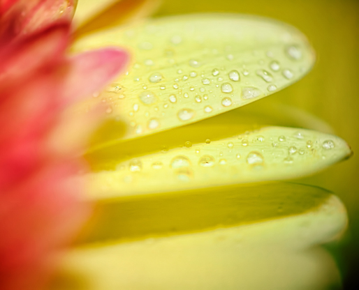
I thought since I’ve spent a small fortune over the past several months trying out a ton of Oribe hair products, I’d go ahead and write a review of the different things I’ve tried and what I think of them. I don’t have any photographic evidence of how this stuff affected my hair, but I think I can use my words to describe how it all turned out.
First of all, I will say that using the Oribe shampoos and conditioners does mean my hair air-dries into a bit of a mess. It’s all natural and lacks all of the sulfites and other stuff that’s supposedly bad for your hair, so while it leaves my hair feeling soft and silky, “soft and silky” on baby-fine hair often = frizzy mess. In that sense, if I wanted to just air-dry my hair without any future styling, I’d be better off sticking with the Goldwell or Moroccan Oil products I use that have the more traditional formulations, because they weigh my hair down more and give me more curl and definition, as well as less frizz. But, since I enjoy styling my hair anyway, I do find that when combined with heat-styling this Oribe stuff is amazing, and in the end my styled hair has less frizz and some really nice wave. Also, I recently added a LOT of blonde highlights to my dark hair, which changed the texture somewhat, and also makes it more necessary to style it than it was when it wasn’t highlighted. Moving on.
I’ve tried a few of the shampoos so far, and here they are:
Oribe Silverati Shampoo and Conditioner

I got this stuff when I was planning to grow out my gray, and continue to use it at least once a week on my blonde hair now. I don’t know that it really makes my blonde look any blonder, but the highlights haven’t gotten brassy or anything, and there’s a cool factor here because the shampoo and conditioner are both shiny silver instead of the usual purple tint. If this stuff didn’t cost $50 each, I’d dump a bunch of it over my head and take pictures, because it really does look like liquid metal coming out of the bottles.
Oribe Beautiful Color Shampoo and Conditioner
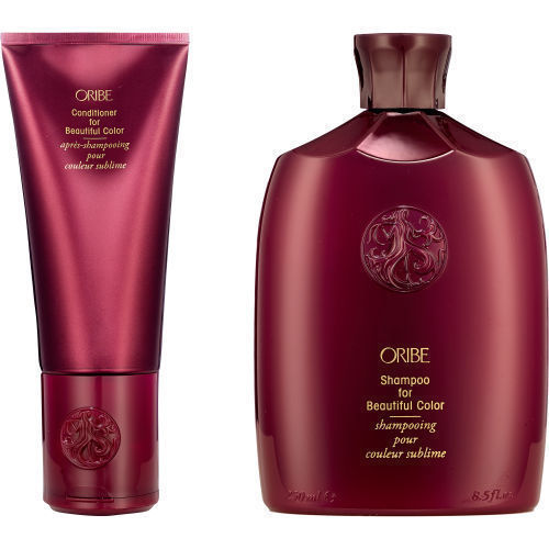
I also bought this stuff to use on the days I don’t use the Silverati. Both of these lines smell and feel amazing, and do not take much at all to lather up and get to work. Again, they both leave my hair feeling amazingly soft and silky, the only downside being that I must style my hair to add some weight and curl to it since it turns into a little puffball without the usual goop to hold it down. Is it worth the money? I think so – if only because it’s so gentle, it smells amazing, and when used with other styling products (oh, so many styling products in my case) my hair really does turn out great, and continues to look great for 2-3 days after shampooing. With my Goldwell or Moroccan Oil, I can’t stretch a shampoo for three days without looking greasy, but with Oribe I can. So that’s something.
Supershine Moisturizing Cream

I’ve found that when going full Oribe, products which add moisture are essential for me. My baby-fine hair tends towards looking dry and frizzy, which is interesting, since when using more traditional products with sulfites and other chemicals my hair gets weighed down and greasy, and I tend to have to wash more often. I’d never dream of using so many moisturizing creams and things on my hair before switching to Oribe, but the overall effect is still hair that feels smoother and lighter than when using heavier products. So, this cream is a real must-have for me; I work it into my wet hair right after stepping out of the shower, and can sometimes add a bit to my hair when it’s dry if it looks a bit frizzy.
Oribe Matte Waves Texture Lotion

Another cream-based product to put into my hair would have sounded insane before Oribe, but here we are. I didn’t get how to use this stuff at first, and combined it with a few other gels which was too much – now, I just put this on after the Moisturizing Cream and scrunch it into my hair and it’s good to go. It doesn’t add a lot of extra texture when air-drying, but I find that it makes my hair very easy to heat-style into waves the next morning and creates a touchable hold that lasts all day.
Split End Seal

This is the product I’ve been using up the most; it’s a smaller bottle so that has something to do with it, but it’s a great little cream that I like to put just on the ends after heat-styling. I often throw some on them when it’s still wet, too; my chemically-treated hair needs help, y’all, and I do think this cream delivers. I also like that it weighs down the ends of my hair a little, which helps since it’s so fine; the ends of my hair can look stringy even without all the highlights, and anything that adds some weight to them combats that.
Oribe Gold Lust Nourishing Oil

I was hesitant to commit to this oil at first, still loving my Moroccan Oil as much as I did, but I eventually gave in to the lovely bottle, the great title, and the desire to go full Oribe. It’s an oil. It’s in a lovely bottle. Like everything Oribe, it smells amazing. And in case I haven’t yet mentioned it, my hair is frizzy, y’all, and it loves hair oil. It drinks this shit up. I sometimes dab a bit on, concentrating on the ends, while it’s still wet, sometimes not – but I always apply it last after putting a ton of other products on it after heat-styling. It adds a touch of sheen and weight that makes my hair look and feel silky even though it’s loaded with expensive goop. Good times.
Oribe Balm d’Or Heat Styling Shield

First of all, aren’t all these bottles just gorgeous? I love to just look at all this crap on my shelves. This was another one of those if-I’m-going-full-Oribe-let’s-really-go-ALL-OUT purchases, but I really ended up preferring it because it’s also a cream, and I feel I can really saturate my strands with it better than the spray form most heat protectants take. Also – and I don’t know why this is – but most sprays I put in my hair end of making it frizzy and dry-looking, including heat-protectant sprays. This stuff doesn’t make my hair crispy or dry at all. And like everything Oribe, I don’t have to use much of it for it to work.
Apres Beach Wave and Shine Spray

First of all, another gorgeous bottle! And, this is one of the few sprays from Oribe, or any brand really, that I feel I can actually use. It’s pretty light, and it does what it says it will do, which is add some volume and texture to my waves. I don’t use it when my hair is wet, though, even though the instructions say you can – this just gives me frizz for some reason, so I stick to using it as a finishing spray, after I’ve air-dried, heat-curled, and applied the Split End Seal, but before I use the Anti-Humidity Spray and Gold Lust Oil. I just flip my hair over, spray some on, and scrub it in, and poof – a little added texture and volume. Voila!
Impermeable Anti-Humidity Spray

If I feel my hair needs it (and living in Houston, Texas, my hair often needs it) I will add this anti-humidity spray to my daily routine. I also keep a small bottle of it in my purse. Unlike the oilier shine spray from Oribe that I tried and did not like, this one smooths out frizz without making my hair look flat and greasy. I don’t use every day, but I use it often enough to know it works to reduce flyaways on high humidity days without dragging my hair down or flattening it out.
OK, so far, everything I’ve discussed is stuff I use regularly – but I’ve also tried out a lot of items that I don’t use as much because they’re either treatments you use less often, stuff I just bought and am still on the fence about, or stuff I just don’t care for. Here we go.
The Cleanse Clarifying Shampoo and Essential Antidote Replenishing Conditioner

Wow, ladies. This stuff is amazing. I’ve tried a few shampooing/conditioning products by Oribe that don’t even look like shampoos or conditioners – both of these come in cans that look like they would distribute mousse, and in fact both of these have that consistency, more or less. Hell, I don’t even know if they do a good job clarifying or conditioning my hair, but the absolutely luxurious feel of these two products almost makes me not care. The shampoo foams out into a rich, fat-ass lather that actually was WAY more than I needed the first time I used it, so now I know to press that nozzle lightly. Honestly it feels so good I kinda want to lick it after I foam it into my hands; it’s already in a lather as it goes into my hair and overall it just feels (and of course, smells) delicious. It’s also this bizarre silvery, shiny color that matches the bottle, which – how do they do that? It’s amazing.
Then, there’s the conditioner. It also foams out into the palm of your hand, but it feels – I swear to God – like warm honey, and smooths into your hair like butter. So, honey butter for your hair. Need I say any more? I used these both after a major-heavy product-trying day, including one product I seriously over-used to the point that I had a big knot of product at my scalp, and everything rinsed out easily and my hair felt soft and squeaky-clean. Love.
Oribe Bright Blonde Radiance and Repair Treatment

This is for use in the shower instead of a regular conditioner about once a week; it’s in a pump form, and the treatment is purple-tinted like a lot of blonde treatments are. I didn’t notice anything majorly different about my hair after using this, but my husband did ask me if I’d gotten my hair highlighted any more because it looked blonder after I used it. So, there’s that going for it. It’s fine, but it doesn’t do anything noticeable enough that I would re-purchase it.
Soft Lacquer Heat Styling Spray

This was the first heat-styling product from Oribe that I tried, and remember what I said about heat protectant sprays leaving my hair dry and frizzy? Yeah, that happened here. When I mentioned to my stylist that I didn’t like this spray because it left my hair feeling crunchy, she laughed and said, ‘Girl, when a product has lacquer in the name it’s gonna be crunchy,” which I probably should have figured out on my own, but whatever. That said – and this is probably going to make me sound a little crazy – I actually do use this product every day, but only on my bangs. Yes, I am very picky about my bangs, so much so that I use a teeny little half-inch flat iron on them every morning to get them just how I like them (otherwise they curl up and I don’t like them) and for some reason, this laquer spray works with the heat to give me perfect bangs every time. Go figure. So yeah, this big old bottle is only used on my bangs and no where else on my head. As is the little flat iron (in fact, I use three different hair irons to style my hair. It’s a process, y’all).
Shine Light Reflecting Spray

Nope. One of the few utter fails from my Oribe experiment. It just leaves my hair looking and feeling greasy. I kept trying it day after day as a last-minute afterthought, thinking my hair still looked a little too dry, but it never did anything but kill all the good I’d gotten out of the other products and tools I was using. When I discovered I could use the Gold Lust Oil, Moisturizing Cream, or Anti-Humidity Spray and get better results, I was done with this one. Doesn’t even work on the bangs!
Swept Up Volume Powder Spray

If you’ve ever tried Big Sexy Hair’s powder spray, then you know what this stuff is – I was always a bit amazed at that product, but the application of it eluded me. I’d always end up with this big WAD of that powder in my hair that I couldn’t distribute through it, so I’d have one blob of sticky, weird, volumized hair somewhere random on my head. This feels like the same product, with a catch – it’s a pump so you can spray the powder onto your head instead of coming in a shaker you have to shake onto it. Turns out (go figure) this makes a huge difference, and I can actually spritz a little of the powder onto my scalp to give my hair a boost without feeling like I’ve put glue in it. But be careful – it’s a powerful little spritzer, and if you aren’t prepared for how much powder comes out with one little pump you’ll end up with glue-head again. It kinda sucks to pay so much more for what’s essentially the same as a $10 product, but form factor matters, people, and trying to shake sticky powder into my hair like I’m salting and peppering myself for supper was never gonna work in my favor. So Oribe it is.
Star Glow Styling Wax

I’ve been a fan of KMS’s Spray Wax for years, as I’ve often used it in lieu of hair spray as a finisher because it’s softer and more malleable, so what could be better than a spray wax but a non-spray wax, because sprays generally don’t work for me? So I decided to give this one a try – it’s described as a “gel-wax” which, whatever, but it is odd – it looks just like honey and is as hard to squeeze out of the tube as honey can be to boot. I’m still not sure what I think of it, because I’ve only used it once and I’d over-used the spray powder already, so it didn’t stand much of a chance once I’d blasted my scalp with glue. But as hard as it is to get out of the tube, I’m not sure how useful it’s going to be. I literally had to crush the damn tube with both hands to get anything to come out, so I’m wondering if I got a defective bottle or something. More on this one later. I got it in the hopes it could add just a bit more texture to my curls, so that’s how I intend to try and use it.
Gel Serum

This was the first Oribe product I ever tried and it was at least five years ago; it was one of those times I was at a salon checking out, and I realized I needed some hair gel, so my stylist recommended this one and I tossed it onto the counter without looking at the price tag. I was shocked when it ended up costing $65, but I bought it anyway, and that one damn bottle ended up lasting me four years! You don’t need to use much of any Oribe products at all because they’re all highly concentrated, and this is a good, sturdy hair gel with a nice, medium hold that does the job nicely. It was good enough that I did re-purchase it, but I don’t use it every day, only at times when I feel a little added hold is needed. I’ve found the Texture Waves Lotion to be my primary ‘foundation’ styling product, but this gel pairs with it fine when I want a little extra hold. Plus, it literally is loaded with little gold sparkly flecks, if you’re into that.
Curl Gloss
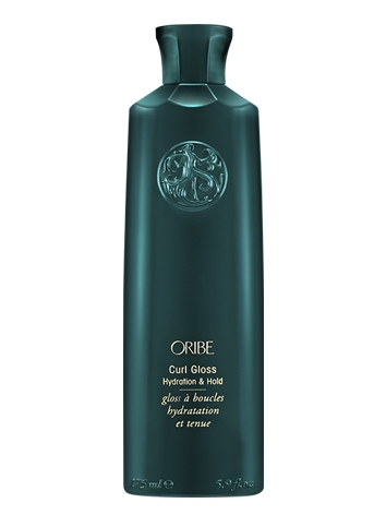
This is another gel that’s fine, and I use it on occasion, but only paired with other products like the Gel Serum or the Texture Lotion. On its own, it’s just too light to really give my hair the hold it needs, but at times I throw it into the mix and it doesn’t hurt anything.
Dry Texturizing Spray

This stuff gets raves from everyone, but for me it’s just meh. As a texturizer, it’s a little drying for me, and as a dry shampoo it doesn’t tend to make any difference – but dry shampoos have never worked on me that well anyway – because again, it’s a spray. Out of this one and the Apres Wave spray I tried, I find the Apres Wave is less drying and gives me better volume without frizzing. This is fine, and it hasn’t ever made my hair look awful, and you can read tons of raves about this stuff from other people online, but it isn’t a huge winner in my book.
Maximista Thickening Spray

Spraying anything into my hair when it’s wet has always been a fail for me, and this one is formulated to be applied to wet hair. It failed.
Volumista Mist for Volume

Same.
OK, so. That’s everything I’ve tried. I didn’t put prices on any of this stuff because it’s all stupidly expensive, and please don’t anyone add up how much I’ve spent on all this crap. I will say, unlike previous hair product obsessions like DevaCurl that I’ve had over the years, I’ve ended up using almost all of the Oribe I’ve purchased on a regular basis, with quite a low number of fails. Most of it I can still use on occasion even if it’s never going to be in regular rotation, and overall I am really impressed even with the things I’ve tried that haven’t worked out. It’s a huge line of products, by the way, and even as much as I’ve experimented with barely scratches the surface of what they offer, so there’s definitely something for everyone – if you’re willing to cough up the cash.