Blue-Over

In keeping with my plan to tax my arm less, I only worked on a few photos today from my latest shoot. Since a lot of my work was focused on fixing some color errors in the photos I posted yesterday, I only have one new one to share today. But first – I went to lunch with a friend today (hi Mel!) and we stopped in at, of course, the one other Free People store that’s in the city. It was a really tiny little shop, but they had this one pair of shoes on display that for some inexplicable reason I thought were amazing – I say inexplicable because this is in no way a shoe I would typically wear. I say one pair because it was literally the ONLY pair in the entire store, and it just happened to be in my size. So here they are – they’re so ugly they’re rather awesome (I have a feeling a LOT of you are going to disagree with me on the awesome part though):

Photo Jun 29, 2 03 08 PM

Anyway, once the shoes were purchased and food was consumed, I got to work fixing the overly yellow tone to the photos I posted yesterday. What can I say, I got too involved in using the RadLab plugins and lost my head. After I posted here around midnight Sunday morning, I went straight to Flickr for my one upload of the day, and as soon as the photo hit my stream I realized I looked like some Victorian Oompah-Loompah – it was just way too much with the gold tones. So, I took that shot down and uploaded one that I felt wasn’t overdone, although it’s still a little yellow. Anyway, fixing this was a bit of a bitch, but on the plus side I did take some time to watch YouTube tutorials and learn how to correct white balance in Photoshop, something I did not know how to do previously. Still took some time with these shots, but I managed as best I could. Here’s the first one I fixed, original first and then the new edit:

victorian3_RadLab_DP

This was the one I first shared on Flickr then took down when I got a look at it lined up against other portraits on my stream. I had to see it in that context to realize how much I looked like an antique Cheeto here. After playing with white balance and some cool filters in Photoshop, here’s the updated version (I changed the texture on this one too, as the one I used above was also very golden):

victorian3_Snapseed_levels_DP

Soooooo much better, yes? The texture is really light here; I was torn about using any at all but I did want the vintage element it could add. I was unsure because I think the lighting on my face here is so nice, and I didn’t want the texture to muck it up. I ended up erasing most of it off my face, just leaving a little light mark here and there for consistency with the rest of the photo. You can mostly see the texture in the mirror and in the lower left-hand corner. It might actually be useless, but what can I say, I was nervous about going overboard with the filters again so I went really easy on them this time.

Here’s the other photo I shared yesterday that I also felt was too yellow, followed by the edit:

victorian2_final

victorian2_final2

It may have been because of the fairly weird lighting here, but I couldn’t use PS’s white balance tool to decent effect, and had to add a lot of blue filters in RadLab to cool the warmth down instead (hence my title, get it?). The lighting is so flash-y because I leaned forward pretty far in this shot, without thinking about how close it was getting me to the camera’s flash; even though I had it bounced off the ceiling my face got too close and blasted out a little by the light. I kind of like the effect that can have on occasion, and I think it works OK here, but it sure  made the shot a bear to edit properly, at least for me. I used the same texture on the edited shot this time, because I think the lightness of it worked well with the brightness of the shot and unified the lighting, in a way. I also added some shadows to my face, especially the eyes, so that it didn’t look as flat as it did in the first version.

Part of the reason I only had time to do one new one today is because this one was also a bear to pull off and took a load of time. I liked my face in this one shot, but as you can see, there was a framed picture hanging on the wall opposite the piano that was showing in the mirror, and the placement of the vase that rests on top of it was weird. So even though I liked my expression as I felt it was a little austere and unusual (which was in keeping with what I was doing in the shoot), it wasn’t going to work unless I got creative.

victorian6

Great expression, terrible background. However, I took a second shot like this after I took that picture off the wall and moved the vase, so my very next shot was much better. Except that I didn’t like my expression as much. There was nothing wrong with it, it just wasn’t as interesting.

victorian5

So hey, I thought, I know a thing or two about a thing or two, maybe I could take my head from photo one and create a composite with photo two to get the right face into the shot with the right background. This is where YouTube came in handy again, because one thing that’s eternally tricky about composite shots is that each shot you take will have a slightly different color balance, and if you are going to take your head off one shot and try to paste it onto another body, your skin tones damn well better match exactly or it’s going to look weird. Which rarely happens right out of the camera, and often causes problems for me. In truth I have to abandon a lot of composite shots because I can’t get the colors to match perfectly, and where I’ve layered one shot over another even the slightest color imbalance will show and screw it up. But when watching the tutorial about adjusting color balance, the video went on to show how you can take the color balancing you just did to one photo, save it as a color profile, then open up another photo from the same shoot and apply that same color profile to it for a pretty close match, if not an exact one. I knew this was possible, but had never bothered to learn it before – it worked well here, and although it did not provide a total match, it got me close enough. So here’s the final composite shot, with the face of shot one and the rest from shot two, as well as some blue filters to cool it down a bit and a little texture added:

victorian5-6_final

I think the shot’s a little crooked, actually, so I may go in and fix that, but other than that I quite like this one. And by the way, I never noticed before that I have Stephen Colbert ears (one sticking out far more than the other). Ah well. I don’t know how many more of these I can edit since this is pretty much the gist of the shoot at this point – me looking austere sitting in a chair or in front of a piano. There’s only so far I can go with that…but I like what’s come out of it so far, and the things I’ve learned while working with these. I certainly got more mileage out of this shoot than I thought I would.

Picture Pincher

Partly to help my right arm heal, and partly to avoid burnout, I am learning to work differently with my photos – especially my self-portraits. Not that I won’t still occasionally go all-out, but I need to avoid the belief that I must go through so much rigmarole each time to shoot them, and that if I don’t have an entire day to devote to makeup and set-up and costume construction then I shouldn’t bother, which is where my head gets stuck if I let it. I also need to calm down thinking I need to a) take 500 shots when in reality, I’m maybe going to process 5 to 10 of them; and b) edit shots obsessively at the end of a shoot until my arm is screaming at me and my eyes are swelling shut and I’m producing nothing but crap because I’m so tired. I can choose to work quickly, take fewer photos, and edit just a few throughout the day while taking breaks to do other things in between, and still be perfectly respectful as an artist – at least I hope so. Because I was starting to feel burned out on taking self-portraits when faced with the prospect of a 2-hour set up and makeup time just to get things going.

Still, I worry about getting lazy or that the photos which result from  a more spontaneous and easy approach will suffer from a lack of heart, or will appear sloppy and shoddy. I rely on you, blog readers, to let me know if that starts happening.  Because I put this shoot together today pretty quickly and didn’t sweat my costume much at all, and I’m not sure if it hindered the results or not. So let me know. I decided to set up and take some portraits in the antique room and I decided to go with a rather harsh, makeup-less look on my face and some austere black to be 1800’s-inspired, but wouldn’t require full makeup or costume. And since I made myself take a break between editing each shot, I only have 4 so far that I can share, but here goes:

victorian1_Snapseed

That’s the original shot, edited and tweaked without filters, but since I’m still using up my trial for the RadLab filtering software I downloaded (I still have 8 days left, then I’m totally gonna buy it) I decided to use a few for the final version. What I used here was subtle and basically changed the tone a bit to give it a more vintage feel:

victorian1_final

The outfit was a little lazy, I suppose (can you tell the top is some sort of rayon and the skirt is knit, cause I can), and perhaps the whole photo is, but I like it and I think it works. I used my 50mm lens and the Speedlite as well as two umbrella stands for that shot, as well as the outside light from two windows opposite me in the room. For these next shots, I did a bit more with RadLab than I did with the first one, so I can show some of their progress as I saved some of the steps to share.

victorian2_Snapseed.

I had this idea I’d do some levitation floating above the piano, but the room is so small and oddly shaped that I’m not sure it’s ever going to work (unless we move the piano – not likely). But I did climb up and sit on it for awhile. The above version is simply tweaked and skin-softened; but here’s how it looked once I RadLabbed it:

victorian2_Snapseed_RadLab

One thing about this shoot that really caused problems in this shot: to save time, I decided to try using the StudioFix powder foundation that I mentioned in a recent post works so well on the sun damage on my neck. Remember how I expressed some concern it would be too dry on my skin? Well I was right. Holy cow you could see every pore of my skin in these shots! So I had to do a lot more softening than usual – especially in this shot where the light was so bright on my face. Anyway, as far as RadLab goes, I added color in the shot above to made it more vibrant, as well as adding light, vignetting, and contrast. I decided to utilize Dirty Pictures, too, to add a little texture – so here’s the final version:

victorian2_final

I really love the textures in Dirty Pictures even though I still try to keep them subtle. I also liked how the color worked in this room, especially all the pops of gold. This next one might be my favorite – original shot up first (already run through PS for skin softening and tweaking):

victorian3_Snapseed

I wasn’t using anything but a Speedlite mounted on top of the camera here, and I think it created some nice shadows – the umbrella stands kept showing up in the mirror hanging overhead, so shut them off and moved them. And one thing about framing here you may have noticed – that mirror is actually NOT centered directly over the piano, so it’s off-kilter a little in the shot (it’s centered on the wall, but the piano isn’t directly in the center…it’s weird and probably stupid  but actually not all that noticeable until you’re taking a photo in front of it). I did use RadLab to brighten it up and give the color more oomph:

victorian3_RadLabAnd then I textured it using Dirty Pictures:

victorian3_RadLab_DP You know though, now that I look at this one, I think maybe it’s way too golden…? I was going for a vintage-feel portrait, but this might be too yellow. May have to re-work this one. One more:

victorian4_Snapseed

RadLab has a ton of black and white filters, and a few of them are very antique in feel, so I knew I wanted to take at least one shot and monochrome it – I went with this shot, even though the pose is definitely not vintage:

victorian4_Snapseed_RadLab

Bet then of course I decided to mess with it some more via texture and tone:

victorian4_finalist1

And then I messed with it even more:

victorian4_finalist2

But in the end, I think this last step was too much, and I like the photo directly above it better.

So, I like these shots, but I admit it feels weird knowing I threw this costume and shoot together (at least when compared to my usual standards) and I’m wondering what you all think. Do they come across as lazy, or sloppy, or without “heart”? Because that is certainly not my intention. On the other hand, if they work, that’s good to know, because it means I can continue to save myself time now and again without the end result suffering. No pressure for you to answer of course, it’s just my photographic future hanging in the balance…

Ice as Nice

We had another unexpected day off Tuesday – an ice storm blew through the city early in the morning, and although the temps didn’t get low enough in our area to ice up the roads, it did knock out power at the school, so the administration decided to cancel. I was already up and halfway ready to go when I got the call, so I decided I’d try out the makeup my friends want me to do for their shoot and see if I could pull it off, and I figured if I was going to go that far I might as well take some pictures.

victorian
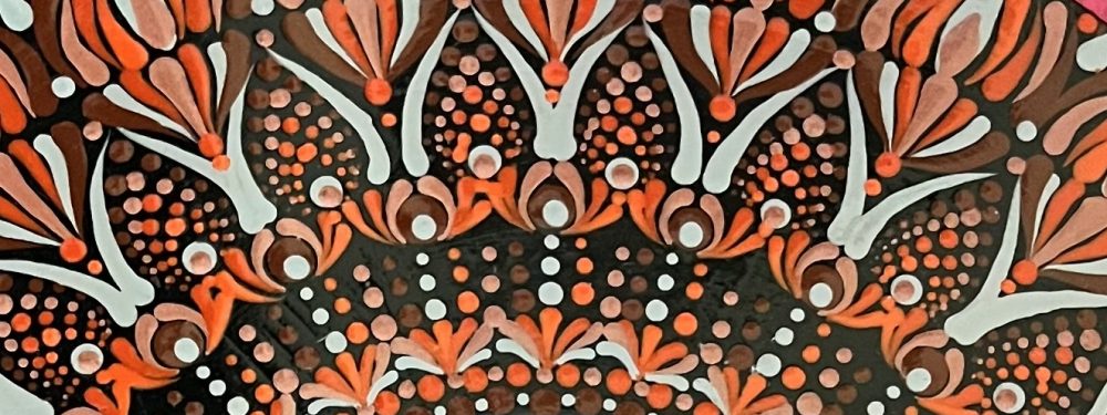
This is the look my friends/models want for their shoot

I don’t know what magic fairy dust was sprinkled over me on this occasion, but I must have done everything just right without realizing it, because the makeup and the portraits I shot came out amazing. I’m not saying that because they’re portraits of me, of course, but because the makeup really popped on camera, the lighting was dead-on, and to be honest, there just wasn’t a bad shot in the bunch. Well, of the portraits anyway.And although I didn’t pull off the exact look of the makeup in the photo above, I got the idea down.

blue3_Snapseed

A few things I did different with the makeup that helped me out here: the last time I was at the MAC counter stocking up, the salesperson gave me samples of a new color-correcting BB cream they’d just introduced. I hadn’t tried it yet, but decided on this day to slap some on underneath my foundation – I have the yellow tint to cut the red in my skin. I have other color correctors on-hand that I normally use (just for photos; I find it’s too much under my daily makeup because my skin is  dry and can’t handle too many layers of stuff without looking cakey and accentuating my pores) but I think this one worked better to create a nice neutral base to my skin. Or maybe it had nothing to do with it and I just lucked out with the lighting, but my makeup was really on point here. Another thing I learned is I can use MAC’s Studio Fix powder foundation on my neck and decollete and it works quite well to cover up my sun damage and hyper-pigmentation. Again, I wouldn’t do this for day-to-day because I’d end up with makeup all over my clothes, but it worked incredibly well for photos, which is when the sun damage shows up the most anyway – I’m really happy with how much of my discoloration the powder foundation was able to conceal. I also think working against the black background helps the studio lighting pop better, because the light is being absorbed behind me rather than bounced back at the camera. It makes for crisper photos overall.

blue4_Snapseed
I had loads of Madame Alexander dolls when I was a kid.

I have a lot more portraits I’d like to edit, but I had other things to do and didn’t want to spend all day at the computer processing shots, so I’ll have to share those later. For example, I realized late in the afternoon that I needed to go vote, so I grabbed Doug and we headed out to our local elementary school, getting there right as class let out for the day and fighting through traffic the whole way as a result. We were both so flustered when we got inside, that we rather forgot we were there to vote in the primaries, and pitched a bit of a fit with the poll worker for asking us if we were Republican or Democrat before we remembered why we were there. I’m sure we appeared just super intelligent, not to mention being the only Democrats they’d probably encountered all day. Anyway, go Wendy Davis.

Back to shooting. I was less successful with my experimental shots, but that makes sense since they’re, you know, experiments. I had a vision of shooting myself standing up with my hands over my face, looking windblown, and then having several images of myself dancing about behind me, all blurry and ghost-like. The shot of me standing still was easy enough, and then I slowed the shutter speed way down so I could dance around and get some blurry movement pictures with the idea that I would create a composite shot to put them all together, but the end result didn’t quite work:

blue2_Snapseed_Snapseed

It’s not bad, but I didn’t take any blurry shots that were posed in a manner where I could place them fully off to my left, like I managed to get one placed to my right, so it’s not symmetrical. Everything was positioned with me leaning out to the left in such a manner that to get the image placed fully to that side, my arms and/or legs would have been completely cut out of the frame (side note: in almost all my movement shots, I lean my body to the left and almost never the right. I don’t know why). I’m not sure I’m even articulating this well, but suffice it to say that I had to stick the second blurry image almost directly behind me instead of having it be off to my side as I envisioned. Also, I was using the camera in portrait mode, and using landscape would have given me much more room to fit the blurry images in, but I didn’t think of that at the time.

I also thought I’d try some levitation/composite shots, so I got a trusty kitchen chair, threw a black fleece blanket over it, and went to work.

bluelev1a_Snapseed_Snapseed
I bought the blue gown off eBay for twelve bucks, by the way. I thought it was an usual color for this type of nightgown, since they’re normally more pastel, and I liked how the white lace contrasted with the bright color.

I played around with a feature in Paint Shop Pro called ‘drop shadow’ that required  me to select just what I wanted to have a shadow in the photo (in this case, my body) and then it created the drop shadow on a separate layer. I then messed a bit with different settings and opacity levels for it to try and make it more convincing, but quite honestly I didn’t spend too terribly long doing this. I was a little tired of editing at this point, and I’m discovering that all this photoediting of composite shots and leviation poses and adding shadows and stitching different photos together blah blah blah kinda bores me. Probably because I don’t really know how to do it all that well, so I get frustrated and bored with it pretty quickly. So, I think the shadow here could have been better – softer, probably – but it isn’t bad. So there it is.

More from this set later. I know I won’t have another day off tomorrow, because true to Texas, although it was 31 degrees here last night, it’ll be back up to 70 by tomorrow – so it’s time for me to wrap it up and get to bed. Crazy weather! More later!