Fab Pants

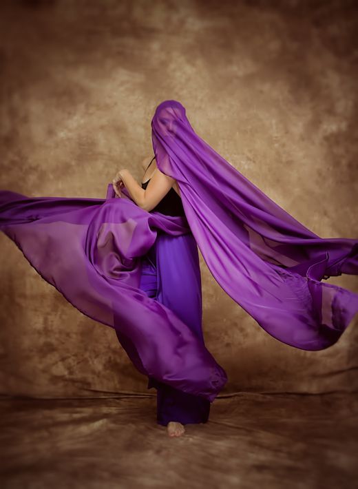
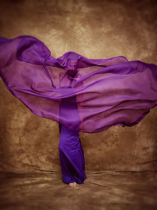
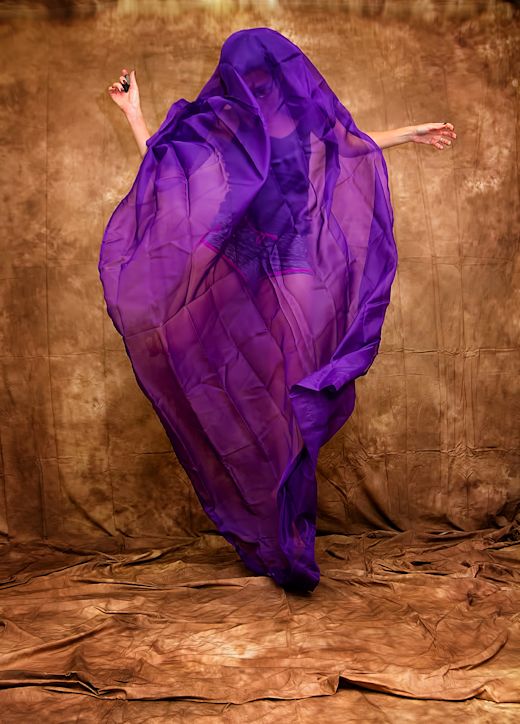
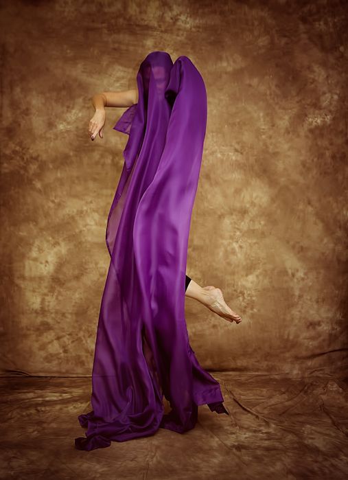
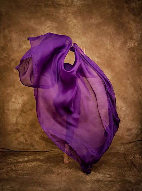
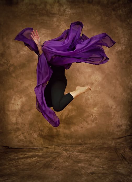
Because I take and process so many photos, I am often pressed for what to title them so that I can keep track of them on my hard drive. I have to do something with them other than just use the numbered data they are given when uploaded to my computer, so I tend to give them whatever title pops into my head first when it’s time to save an edited file. The title that popped into my head when working with the shots I took Saturday was “Fab Pants.”

FabPants2_Snapseed_pxr

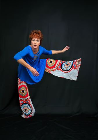
Then every shot from that set that I process I just number; so far I’ve got a “Fab Pants 1” and a “Fab Pants 2.” This is all I’ve had time to edit since I last updated, but I wanted to share it so I had to reach a bit to come up with a blog post, hence the rather lame rambling I’m doing right now. By the way, for anyone who’s curious – I actually had my leg up on a chair when taking this shot. Then I used the composite technique to remove the chair when processing. I’m getting better at this whole thing, I think. Even added some decent shadows this time using the burn tool in Photoshop CS5.

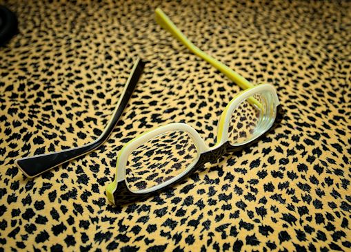
I also thought I’d share that I suffered my first optical tragedy during Saturday’s shoot: I always wear a spare pair of glasses when I’m shooting self-portraits because there’s so much putting on and whipping off of the spectacles that I worry about stretching out my real pair. I have several spares to choose from but I use the weirdest ones since I care about them the least. I will usually keep the glasses on until right before I hit the remote, then I toss them onto the floor somewhere for the photo, and sadly, on Saturday after posing for the shot above my left foot came down right smack on top of them and broke them. I knew it would happen someday, and as I said it’s fortunate that they were a pair I didn’t like very much – although they looked great in photos, they were too harsh on my face to wear them out of the house, and my husband always said they made me look angry. I don’t think he’ll be sorry to hear they had to go.

brokeglass_Snapseed

By the way, it appears that Fly Fest 2014 has finally wound down, a torturous six days from when it started, with just a few stragglers hanging about that have yet to leave the party. Here’s hoping that’s the last aspect of the cycle of life currently breaking down inside our bedroom wall that we have to deal with.


I Should Be Dancing…But I’m Not

I edited several of the shots I took a few weeks ago where I looked up photos of dancers on Google images and tried to imitate their movements (much safer and more appealing than photos of me actually attempting to dance) and worked them into a collage because on their own, I thought most of the shots were kinda boring.

movecollage

I picked which shots to use intuitively, with the idea from the beginning that I would put them into a collage and therefore each shot would be small, so I didn’t think too much about my facial expression in them, or that my hands and feet were as close to perfect as I usually like them to be. Basically, I wanted interesting shapes that were varied from photo to photo but still complimented each other, and that was all.

However, several people on Flickr asked to see each shot on its own, and while I’m not going to use up my one photo a day upload over there posting these shots individually, I’m OK putting them up in a post here. Maybe I can Pixlr them later and then I’ll feel they’re worth sharing other places, but for now, it makes for an easy blog post since it’s late and I don’t have time to say much more. So without further ado, here they are, in no particular order:

move1_Snapseed move2_Snapseed move3_Snapseed move4_Snapseed move5`A_Snapseed move6_Snapseed move7_Snapseed move8_Snapseed move9_Snapseed

More purple

So this costume change isn’t much of a change from the photos I shared yesterday. Basically the difference is I have on these wide-legged purple pants I bought off Amazon when I was searching for dance attire to wear in photos (this was before I discovered the joys of online vintage shopping via eBay). The pants are actually praise dancing pants, and I can honestly say I had not heard of that particular term before when I bought them. I had heard of liturgical dance, obviously, but the phrase “praise dancing” was new to me. I was sure I was the only person among my friends who’d ever heard of it, but so far, everyone I’ve told about it has already been familiar with the activity. So I guess I was just out of the loop on this one. Moving on.

Anyway, I put on the purple pants to add more flowy fabric into my movements, and I like the way they turned out even though the purples don’t quite match. This was actually the first outfit I wore, and these were some of the first photos I took; I realized after the fact that I needed to move the camera back some as a lot of these shots do not capture all the fabric in the frame. Bugs me a little bit, but I liked many of the shots enough to use them anyway.

I just realized I only have a few from this costume so far; much more to come. It may not be until the  weekend when I have time to work with more editing but I know I have more to edit from this section of the shoot.

purple4
I blurred the edges because I felt it made the cut off material look more intentional. Not sure that’s gonna fool anyone though.

purple6
What can I say – I could not be any happier with how these curtain sheers worked with the camera.

So just two for today. I am itching right this second to dig into the RAW files and find a few more to edit before posting, but I know it’s going to throw me off schedule if I do that, because I will get so engrossed in the work I won’t get myself to bed on time or anything. So I will have to be happy with only sharing two photos today. More later though! There are wigs and Mardi Gras masks involved in the next set of shots!

The purple series

Oh Lord have mercy, I have a ton of these I want to edit. I think I might actually do it this time, instead of saying that then getting bored after processing 4 or 5. I’ve already processed 14 of them – using a backdrop that required no editing and sticking to the basics when processing helped to move things along for me. Plus, when I’m all dolled up in costume I feel no one wants to see 30 pictures of me in the same outfit just moving my arms a different way; with the purple sheers, it’s more about the shapes the fabric make than anything I might be wearing, so I think that gives this set more longevity. If that makes sense.

And by the way, I woke up with sore shoulders from all the steaming I had to do the night before to get the wrinkles out of both the backdrop and the sheers. I did get my husband to move the backdrop all the way up to the ceiling, and after all the work I did on it I am just leaving it up for now. No way am I folding it back up right away and creating more wrinkles! So, when I turned my studio back into an office I left the backdrop up and kept the pictures that usually hang there off the wall. The more I get into this photography stuff, the less office-like my office looks, and the more it transforms into some crazy photographer’s messy, chaotic work space. Oh well.

For reference, here’s how wrinkled everything was right out of the boxes – I took some test shots Saturday night, and yes I was in a pair of swim shorts because it was so freaking hot that day – but you can see how much better everything turned out after steaming (although according to my husband I have damaged the sheetrock by steaming the backdrop right up against the wall; didn’t have the heart to tell him I’ve been doing that regularly for the past two years):

sheer
This entire set needs Botox.

I did do a few outfit changes, although they were slight, so perhaps I’ll try to upload over the next few days by collecting the different looks together – but in many of them, you can’t tell what I’m wearing anyway. For today’s installment, I didn’t have much of a ‘costume’ on with the sheers at all, just black tights and a black leotard, and a black wig cap to hold my hair in place. (Moment of vanity here – the leotard was a weird fit on me, as things like that always are due to my long torso/short legs body type. The way it was pulling on me made me look much thicker around the middle than I actually am; my waistline was pretty much disguised, and I readily admit that there are a few cool shots I passed over because I looked, well, chunky. And yes, I did try to edit my waist into the shots, but you could tell. Moving on.)

purple9
I love how tall this one made me look, and the balance of the feet peeking out on one side, and then the opposite hand. Totally accidental on my part, of course.

purple11
Love the shape this one created.

purple12
This reminded me of an octopus, or a flower. The two do have things in common, you know.

For fun, I’ll go ahead and throw this B&W in here. The photo itself wasn’t all that thrilling, but I did like how I came out looking like some sort of sad, gothy sea-creature, so I thought a little monochrome might add to that mood. Throw in some overlays and textures via good old Pixlr, and there you go. Nice and spooky for Halloween.

purple3

I did make a collage of all these with the idea of sharing them in one shot, by the way – but I do not like how small it makes each picture. I prefer to share these full size, or as full size as they ever are when I post them on the blog. For a true high-quality copy you can check out my Flickr page, but I only post one photo there per day.So much more to come from this set!

Muddy photos!

I mentioned in yesterday’s post that I’d had trouble editing the background of some of my flipped photos. I worked on correcting the problem this evening, so I figured I’d go ahead and show you what I was talking about that had been bugging me as well as share the final results – so here goes.

Since I was rotating these shots, I had to crop them in an odd way to get the composition right, and as a result there was a lot of space added to them that wasn’t in the original. I know I am not articulating that very well, but basically, I took photos that were horizontal rectangles and cropped them into squares, which added a lot of tacked-on gray space that wasn’t in the original shot:

tutubefore1

I then had to use a clone tool to cover all this gray with the white background. While this sounds easy enough, a solid white background actually has an astounding amount of variation in shade, and it’s hard to clone all that gray space so it blends properly. I am sure it’s possible, but I don’t have the skill to pull it off every time. And as it turns out, white is way more difficult than the purple I used last time I flipped photos. Anyway, after cloning white space onto the gray and pulling the shot into Photoshop to try and blend the cloned areas using the patch tool, the end result was, well, patchy and smudged, as if the backdrop itself were dirty. It’s not terribly noticeable in the first shot, so I circled the bits that were bothering me:

tutusmudge1

I also had a harder time using textures than usual with these shots because tulle is very transparent, and it wasn’t easy to select the subject and erase the texture from it (I wanted to be lazy with these two shots and leave a white background with no texture, but it was not to be). In the end, I did add texture to conceal the smudges:

tutu10The final shot. Still smudged, but now it looks more like part of the texture.

I think the whole process is more clear in this next shot, where you can definitely see the muddiness of the background that was bothering me. But the first thing you can see is that I tilted the hell out of this shot. I wanted my upper body to be parallel to the imaginary horizon line, so I did quite a bit of horizontal rotation after flipping:

tutubefore2

Cloning and patching out all that gray, plus the differences in shading between the blanket on the floor, the sheet on the wall, and the plaster, made for a seriously dirty looking background. If you REALLY want to see how bad it was, tilt your laptop screen back a bit for this one, and – YUK! – you can see more detail of the poor blending job (and yes, this is after editing and fixing it to the best of my ability):

tutusmudge2

No WAY that was tolerable, so I added the same texture as the first picture to disguise it. Took more time, but it did solve the problem:

tutu11

As I mentioned before, this flipping photos stuff involves processes I don’t have to use for straight-on jumps, and I started to get tired of all the cloning and patching and blending and texturing; in the future when I do this, perhaps I can at least avoid a white background as it’s trickier to edit. Either that or forgo the tulle so I can add texture behind the subject without so much hassle.

Tutu shoot

After my disappointing grocery store trip that yielded little in the way of decent photos, I decided to throw up a backdrop and try out some more jumping shots Saturday night, with the intention this time of flipping them to look like I was falling. It’s a different sort of jumping this requires – I am used to facing the camera as I leap, and trying to get my legs as high off the floor as possibly to add to the effect of height, but for these flipped shots I just need to look like I am falling backwards or forwards, so I can make smaller leaps with my feet staying closer to the floor. It’s also a fairly different process to edit the shots, but in spite of the differences I think this was a successful experiment.

tutu1

I also noticed how different it is to jump without all the fabric and hair to worry about as I usually do. I’m normally concerned with getting the hair and the clothing to move in a certain way, but here, it was just my body I had to concern myself with. The tutu wasn’t going to flow in any other direction but outward no matter what I did, and since I had no wig on I didn’t have to concern myself with flinging it about. The end result was a lot of really nice jumps that didn’t have some of the usual bloopers such as wonky hands or weird faces, although that did happen on occasion. But all I had to think about was keeping the toes pointed and the fingers from going crazy and I think that’s why I got so many good shots in such a short time. Not that this means I’m ready to reject my usual layers of flowy clothing and long hair, because I will always love that stuff. But sometimes it’s nice to change things up.

tutu4
Of course, the occasional weird face did make it into the set. I still liked this one enough to process it in spite of the strange expression.

Because I didn’t get started until later in the evening (I usually set up and shoot in the morning and early afternoon) I did not bother with stage makeup or an elaborate outfit; I also didn’t much feel like putting on a wig – I just wanted to jump around.

tutu7

I used one of the fabulous headscarves I bought from BeauBeau headcovers – these things are great if you are like me and can never successfully tie a real scarf around your head. They’re pre-tied and just slip over your head like a cap. I love the look of a good scarf over my hair, and even though they are marketed towards women with hair loss I have a ton of them and wear them quite often – but I digress.

tutu6

I also incorporated another plastic mask I got from Party City, a white one this time, but I’ve found that after trying masks out twice, I really don’t care for what they do to a photo. I guess I like faces and facial expressions too much, or maybe I need to buy better masks instead of the $3 cheapies at the party store. Not sure, but neither time I used them was I pleased with the effect. So I most likely won’t be doing that again.

tutu8
Um, no.

For the tutu pics, such as those I’ve shared above, the lack of stage makeup didn’t bug me too much, but I also wanted to test out this idea I’ve had for quite awhile and keep forgetting to try, which is layering myself in petticoats and letting them all fly about in jumping shots. I did put a wig on for these, and I really felt the lack of proper makeup later when processing them. I am not criticizing my appearance without loads of war paint or anything – it’s just that in photos, with the amount of bright light I use, facial features disappear if they’re not exaggerated. My eyebrows in particular won’t show up at all, and my eyes appear to sink back into my skull. I’ll have to try this again when I have time to apply a full face. Also, I need to fluff up the petticoats some more, that bottom green one wasn’t moving about as much as the blue one and it kept leaving a “gap” in the material.

tutu3
Love that wig! It’s a Gothic Lolita, of course.

I have tons more of the tutu ones to process, and a few more with the petticoats I’d like to work with also; this isn’t even everything I worked on the past two days. In fact, I sat at my computer processing shots from 10 AM to 3 PM Sunday, which would be pathetic if it didn’t produce something I consider to be art at the end of it all. But it did, so I am happy. Also, while I usually work with different filters and textures for each shot I edit from the same shoot, this time I kept the process the same for all the tutu shots (except for the mask ones) which feels a little odd to me, but I thought it created a better sense of consistency. I am always changing up what I do and how I do it, so that’s what I went with this time. Here’s a quick collage of everything I’ve edited so far:

collagetutu
By the way, I use good old Pixlr for my collages. Is there anything that program can’t do?

And that one in the middle occurred right before I tore down the set; Sprocket had made himself comfortable on the fleece blanket I’d laid down on the floor, so I decided to do a few leaps over him for fun. Here’s the one I ended up processing:

sprocketjump

New video – departure

This is the video portion only of a new videopoem I’m working on. In full form, with the spoken word, it will be about 4 minutes long.The footage is from two public domain films I found at the Internet Archives; the dancing, believe it or not, was filmed as supplemental footage for a movie called “Blood Bath,” and all the other footage is from a film called “Romance Sentimentale” by Sergei Eisenstein. The song is “Good Friday,” by CocoRosie.

I noticed after uploading that the “colors,” such as they are, are different. I’ll be sure to correct that before completing the spoken word version.