Photo Phun

I’m really running out of title ideas, sorry. But this poorly-titled blog post is brought to you by my RuPaul’s Drag Race Season 8 obsession, Acid Betty:

9079-1600-wide
Gee, I don’t know what it is about her that fascinates me…

Betty is a controversial queen, because she’s really playing up her bitchy side for the cameras and the editing is responding by presenting her as the villain of the show; it happens every season and usually I cannot stand the girl who gets the ‘bitch edit.’ But Betty’s look is right up my alley, and when she presented this look for the Oscars Runway challenge I had to pledge her my allegiance for the season:

download
I LIVE
It’s also easier to love her because she is clearly PLAYING at being a bitch and not just behaving that way by accident; it’s a role she’s been sharpening for years in NYC, but the reality show audience is interpreting her as overly harsh. Whatever. My beloved Pearl from Season 7 was a controversial queen too, but ultimately it’s the look that wins my heart, and Pearl and Acid both have mine in spite of whatever shortcomings might get highlighted by a reality show. Rumor is that Betty doesn’t make it much farther in the competition, though, and that is going to seriously bum me out if it’s true – usually the queens I favor go far in the competition so I will hate it if this time my idol sashays away too soon. But, there is a hell of a lot of good talent on the show this year and plenty of other queens to root for if this is the case. Moving on.

I’m also bummed because I have to  travel tomorrow for a work conference; sure, the destination is San Diego, CA, which is great, but still, there’s the traveling part to deal with, and I hate that. I don’t like flying in spite of how much I love airplanes; it’s not that I am at all afraid to fly (and in fact I actually quite like that part of it) but I hate dealing with airports, meeting deadlines, and most of all I hate packing. The day before a flight I always go into a complete panic, feeling like I am not prepared to travel at all and going shopping at CVS to buy as many tiny bottles of things as I can find, making list after list and double-checking everything out of fear I am going to leave something behind, or get to my destination only to realize that I packed the wrong shoes or am in a climate with dry, cold wind that leaves my lips parched and in need of the Blistex I forgot to bring. This is completely illogical, of course, because unless one is traveling to a remote location boots and Blistex can be purchased in any number of stores, but there it is. I panic nonetheless. I think it has to do, psychologically, with my need for safety, routine, and familiarity; I have a very CERTAIN WAY I like my mundane daily activities to proceed, and when in another location far from home I am thrown off completely. I unpack and immediately realize I don’t want to wear ANY  of the outfits I brought to wear (especially if someone with whom I am traveling brought clothes that look better than mine do; yeah, I’m that vain). I realize I should have brought a comfy pillow since the hotel ones are cheap, or that I really would like to have the flat iron with the 1.5″ barrel instead of the 1″ one I brought along. In short, I am high maintenance, and traveling just ain’t my thing. But off I go anyway.

lighting12a
Praying I bring the right flat-iron

This past week I worked more with Portrait Pro on the photos I was able to take over Spring Break, and on occasion I continue to use too much skin softening and coming out looking a little plastic. That happened in this case, so I did my usual and added a bunch of texture and overlays to hopefully disguise it a little bit. It’s funny, because clearly I don’t care if people know I edit the hell out of my photos for effect – my face shape, nose, and eyes in particular are completely re-created here – but when I overdo the skin smoothing it reads ‘phony’ to me. And the reason why I end up overdoing it so much is pretty silly too: after sharpening the photo (which is generally the last step) I can magnify the photo to full-size (which is freaking HUGE) and see all sorts of flaws in the skin that the sharpening accentuates, and it bugs me so badly I have to go back and re-soften all the big pores, fine wrinkles, and color inconsistencies that you really can only see if you magnify the hell out of the photo – AS IF ANYONE BUT ME EVER DOES THAT. No one, and I mean NO ONE is blowing my photos up to full size to look at my pores or messed-up makeup application aside from me, and yet I do it every time and obsessively correct all the errors anyway. And there’s the rub: it’s the little lines and flaws that add depth to the face, so when I edit those all away the end result is a face that looks like it’s been sculpted out of butter. I do a better job than most at keeping the texture and sharpness of everything else without going overboard, but try as I might I just CANNOT leave the skin alone. Some day I’ll learn.

Another new feature I’ve tried out a few times with Portrait Pro is the hair-coloring feature – in the photo above, the wig I’m wearing is actually black with dark auburn highlighting in the front (it’s the same wig as the second photo posted here), and in the one below my hair was actually a highlighted blonde (it’s the wig from this video review):

lighting14

The software does a pretty damn good job with changing haircolor and maintaining the texture of the hair, if you do it right and have time to play around with it, at least. It’s all so much fun and gives me hours of entertainment; I remember when I was a kid how much I loved to turn the ‘tint’ knob on the television while watching ice skating, because the skaters’ dress colors would change (yes, I am old enough to remember when there was a ‘tint’ knob on televisions, and I was weird enough to actually spend hours doing this). That’s kind of what it’s like to play around with changing my makeup and hair color in Photoshop (I also used to use markers to re-color all the makeup on the models in the JC Penney catalog when we got it in the mail, so I’ve been strangely entertained by stuff like this for awhile). Speaking of re-coloring my makeup – in this shot I was originally wearing bright orange lipstick that really looked horrible on me (I can pull the orange off, but not while wearing watered-down colors like peach and ash blonde) and another fun side note is that the peach top is actually a cardigan, and to use it in these photos I put it on backwards – something I do quite a bit if I really want some of what I am wearing to show in a portrait (see this collage for other examples, all three portraits were taken with a shirt or dress on backwards).

lighting6

OK now, I know this photo is over-edited all to hell (especially  based on all the comments it got on Flickr which pointed this out, albeit in a good-natured manner) and yet, I think it really works. I don’t know who I look like here, it’s someone I can’t place right now but it’s definitely not me; I really liked how I was able to bring out (i.e. totally fabricate) the peachiness of the skin and makeup and man, in spite of its flaws that wig takes BEAUTIFUL photos. I hope my friend Lana can doctor it up and wear the hell out of it, because it is lovely.

After over-editing the skin and thinking it looked too flawless (no, I did not wake up like this) I tried out a black and white version, but in the end decided to stick with the color, as I usually do since color is my THING.

lighting6_BW

It’s quite interesting to work this closely with my face and learn what tweaks I feel take me from perfectly acceptable to fabulous; I always widen the distance between my eyes because they are a little close-set, and I definitely do slim down my nose, even though my original nose isn’t a feature that has ever bothered me – it’s just more visually appealing when it’s a touch thinner. I also mess with face shape a bit; I usually prefer to shorten and slim my chin a little and widen my brow, making my face more heart-shape than oval, and even though I already have a nice neck (length-wise anyway; age-wise it’s seen better days, but COME THRU Photoshop and it’s all good), I tend to go ahead and make it longer anyway since for a portrait it’s more appealing. My cheekbones are pretty good, and I’m good at using contour to add depth to them anyway, so I don’t have to do much there; and then I go to town playing around with color, completely changing my makeup shades and usually doing something to change the color of my eyes. And yes, in the first photo shared here I made one eye blue and one brown, just because.

Honestly, the main thing that I feel I would change about my face if I could isn’t possible through plastic surgery, which is widening the distance between my eyes. With glasses on they can easily look even MORE close-set, which is why I am so particular about the size of the frames I will wear. But you can’t go to a plastic surgeon and ask him or her to MOVE YOUR EYES TO A DIFFERENT LOCATION ON YOUR FACE, and if you do and the surgeon agrees, please run away quickly and save yourself. So, Portrait Pro and makeup tricks it is. Moving on.

Two more I messed around with this week; I’m OK with these two, but they’re not thrilling, so I don’t have much to say about them. The cloth over my face in the second photo is just a shirt I was flinging about for the hell of it, and believe it or not I captured this shot without trying at all to frame my face with it; the top just flew up that way as the camera went off, so I thought that was pretty cool.

It’s past 9 PM here and I need to get my butt to bed so I can wake up at 4:45 to make my flight, so I’ll leave you with this last shot, which is one I really like; one thing it makes me think to mention is that the Portrait Pro software really only works in shots where the face is looking directly into the camera. The program uses adjustable placement points to determine where the features of the face are, so when the face is in profile or greatly off-center it just starts guessing where the eyes are, or the nose, or whatever. The result of this can be amusing, but unattractive, so I’ve learned by now to use PP sparingly in shots where the face isn’t basically head-on. I used it to shorten my chin, slim my nose, and touch up my lips a little here, and that’s it – but, because the software insists on finding TWO eyes even when there is only one showing, before I edited it out there was a random, misshapen, floating eyeball hanging out in my hair, complete with wonky eyebrow. It was amusing, and I should have saved a copy of it that way for posterity, but I did not. So here she is, without the hairy eyeball, and with this I will say good day, until next time:

lighting13
Yep, it’s the backwards cardigan again. And you can see some of the wonky wig hairs at the crown that I mention in my video review, too. But other than that, it’s a lovely wig.

Advertisement

Spring Brake

Once again I have to say I’ve been way too busy to type up blog posts, so there it is. And here’s a new one, since although I can barely believe it, Spring Break is here and I have a week off. It feels like we’ve just barely gotten past January, but it’s mid-March already and the school year is zooming by quickly. It’s been a tough year in many ways, some of which I’ve written about on my private blog, and some I’ve yet to share because I’m still processing it all. But for those of you who follow me there, that big old blog post of crazy will be going up soon.

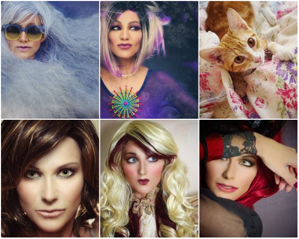
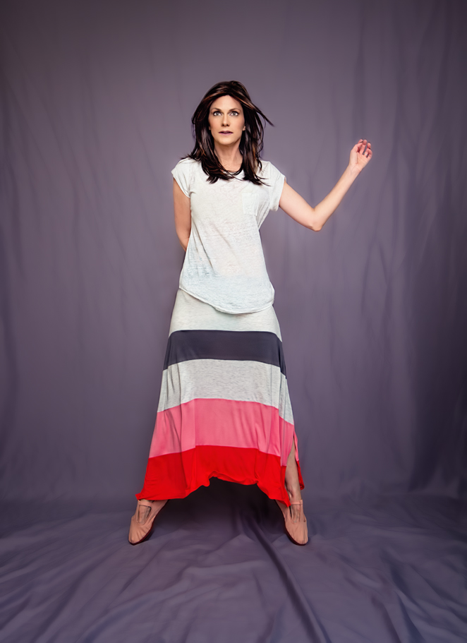
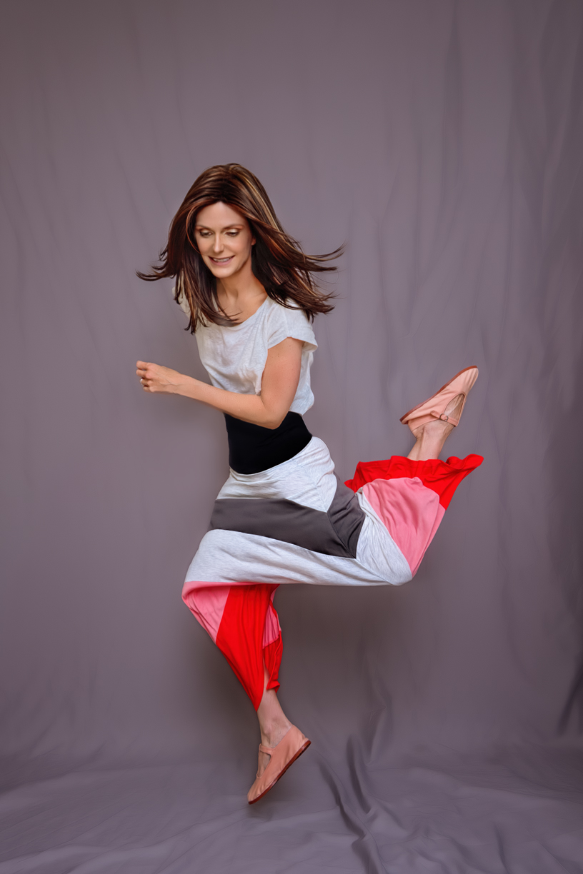
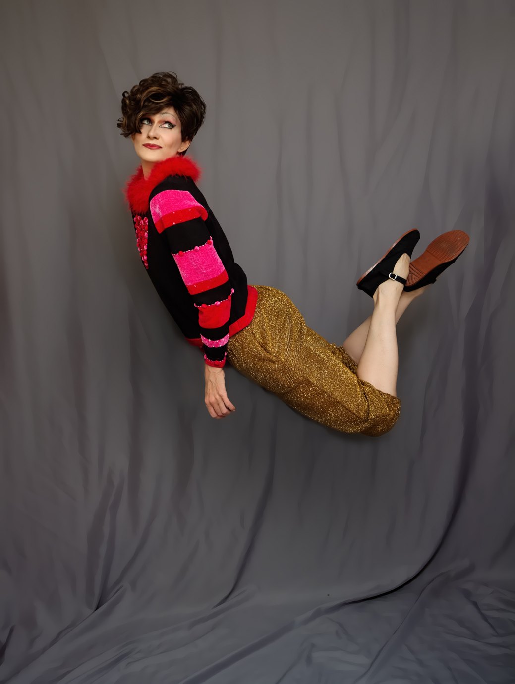
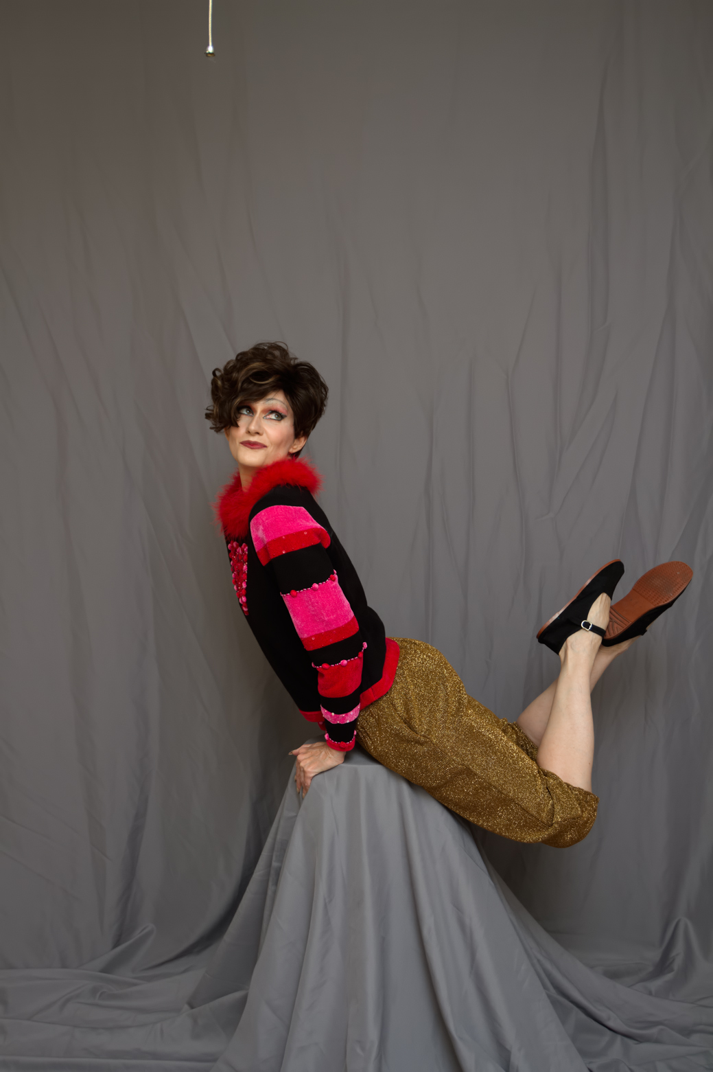
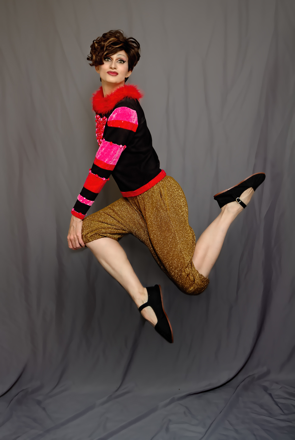
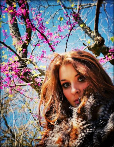
For everyone else, there are more wig videos to come (have two more arriving tomorrow) and a few new photos to share. I finally got a chance to dress up and shoot the last Saturday, so I’ve worked on a few since then and will continue to work on more. I haven’t taken real photos since December, so it’s been awhile. I also worked over some old shots back in February when I didn’t have anything new to edit:

old_collage

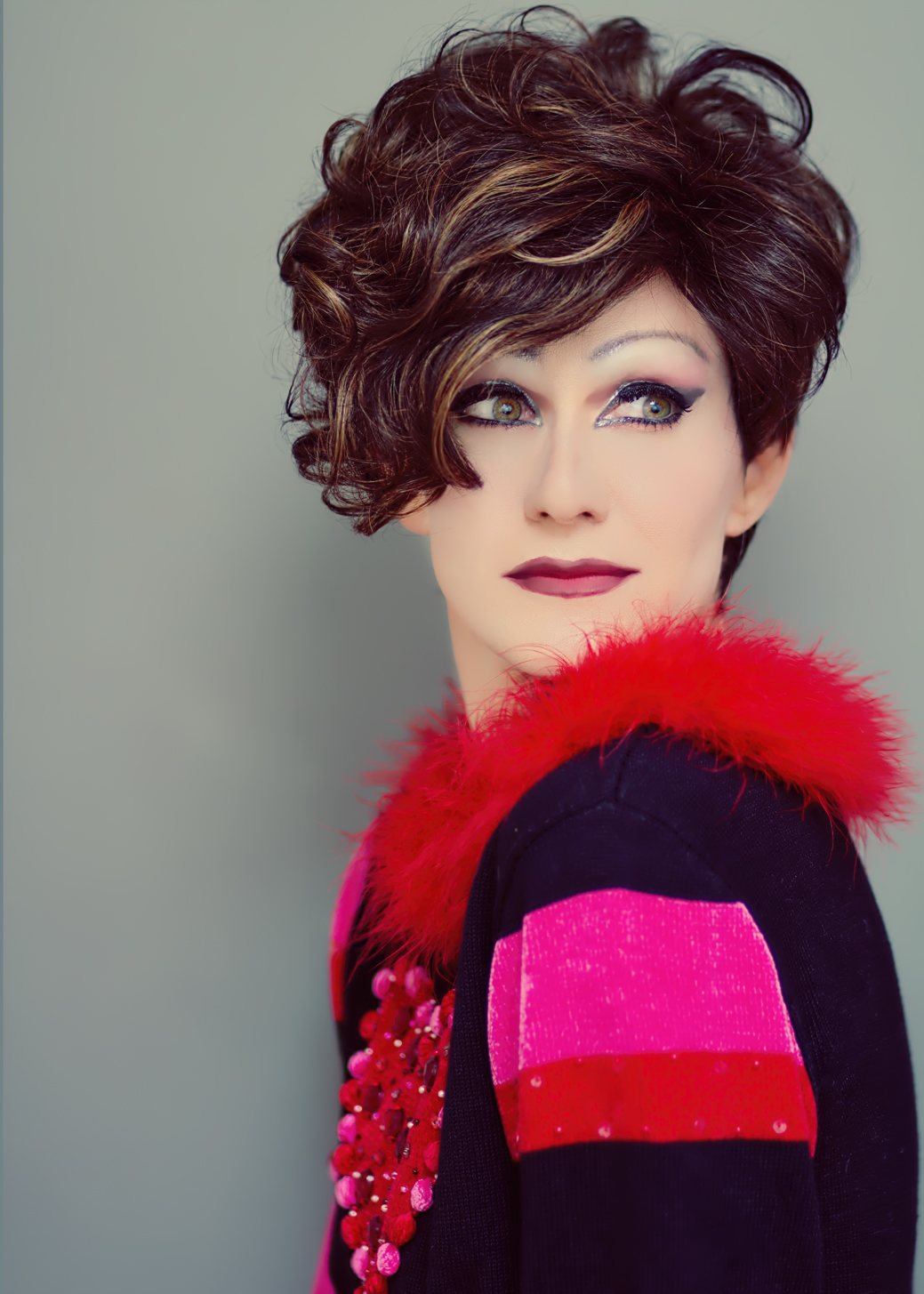
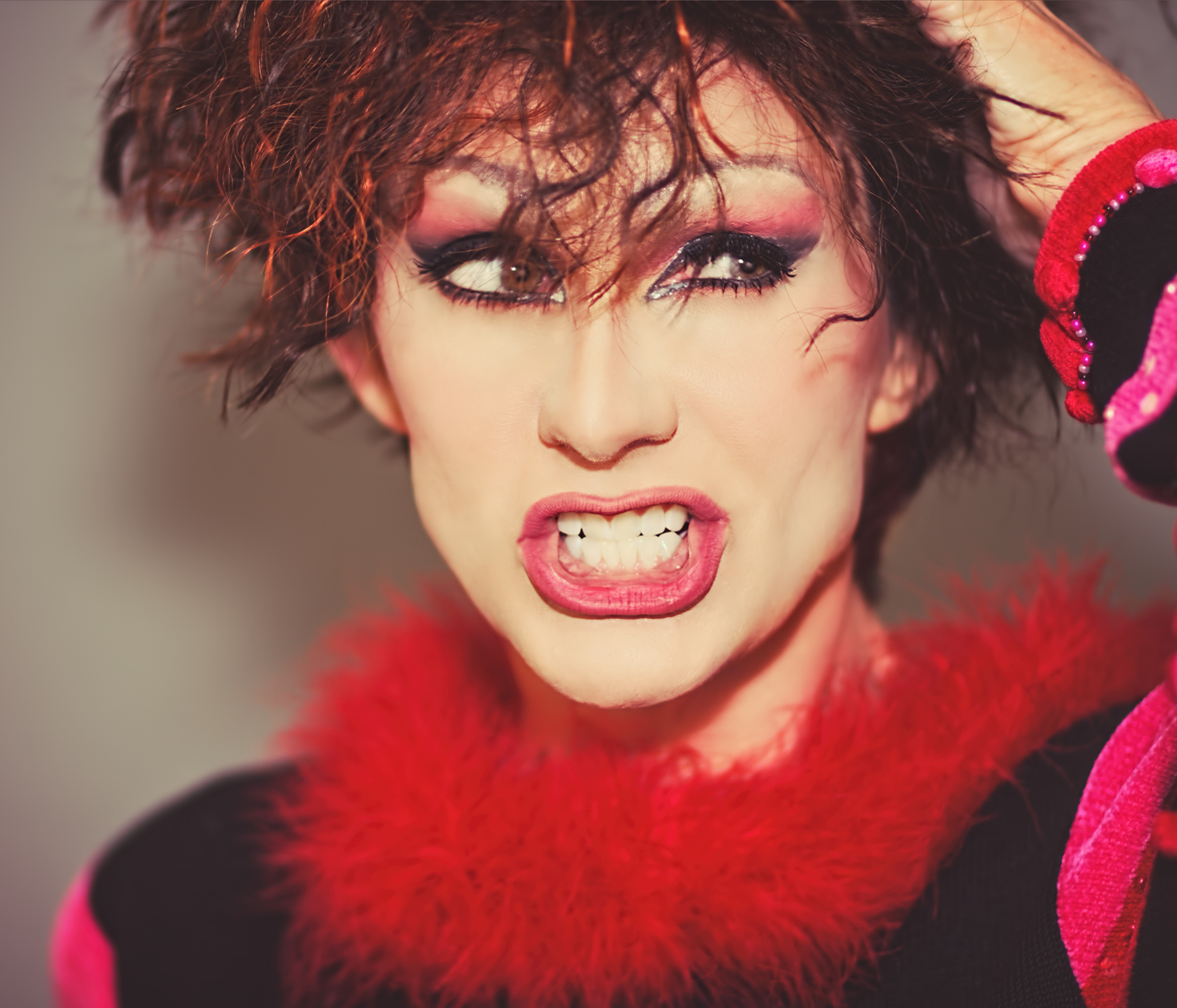
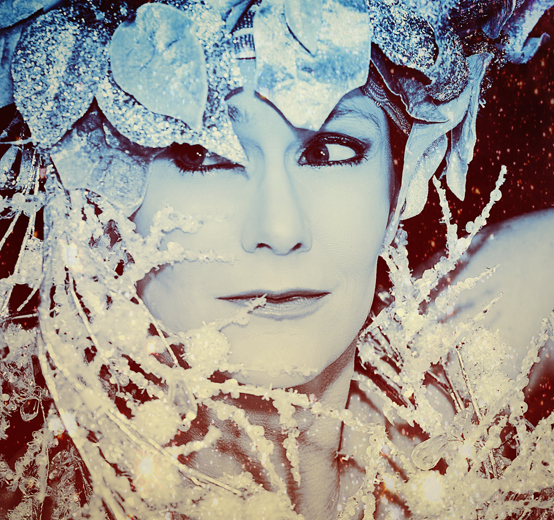
I’m still playing around with the Portrait Pro software I bought recently, and it’s a real blast. I over-do it a lot, but I’m learning how to apply the effects with a softer hand – although on occasion I still do too much and the photo comes out looking way more edited than I’d like. In those cases I usually just add some texture or surface effects to disguise the over-smoothed skin (which is my biggest downfall).

lighting1a

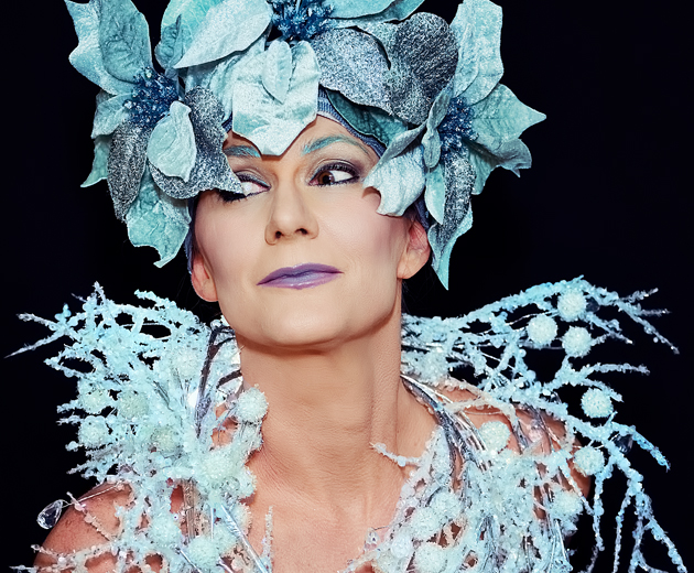
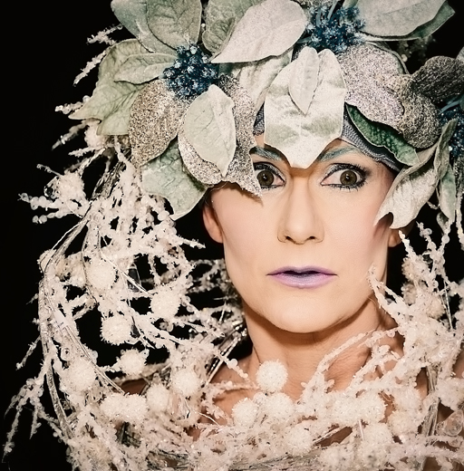
For my last set, I also played around with lighting a lot, which was great fun, but it means my usual editing techniques don’t work as well, and sometimes the end result isn’t quite what I want. In the photo above, I’d used a softbox to hit my face with more light, which eliminates a lot of soft shadows and small detail from the face. The result is a more ‘high-fashion’ look (in my opinion) which a lot of hard shadows and angular edges, so a face can end up looking a little ‘flat.’ It’s not a bad effect, but it requires different editing, and although I really love that photo it doesn’t look much like a real person. So, I added a texture to it to give it an even more animated feel. Sometimes you gotta go where the photo leads you, after all.

lighting3

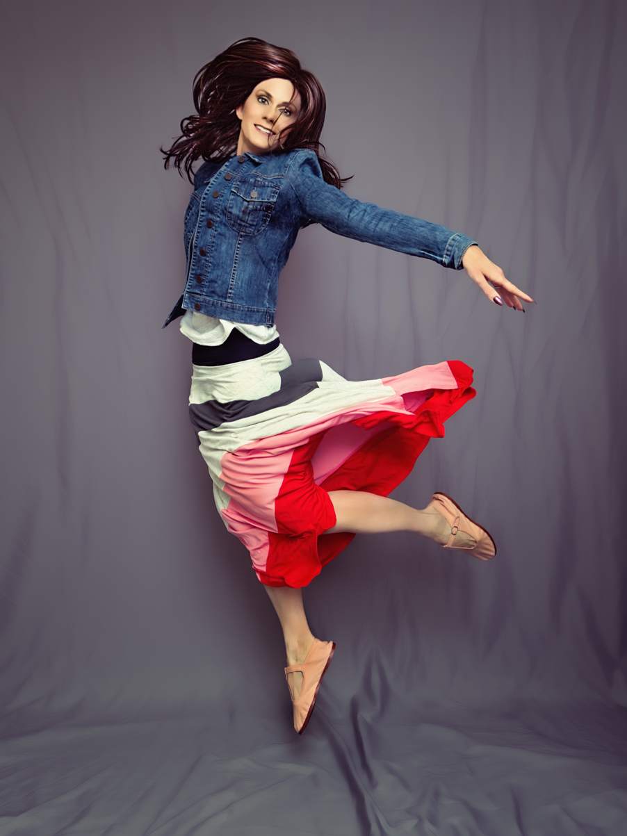
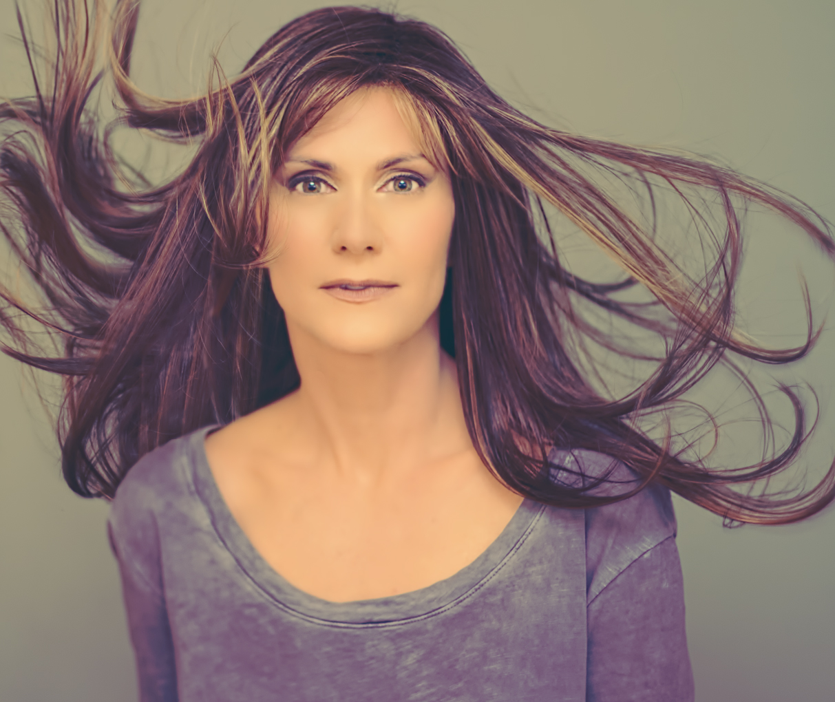
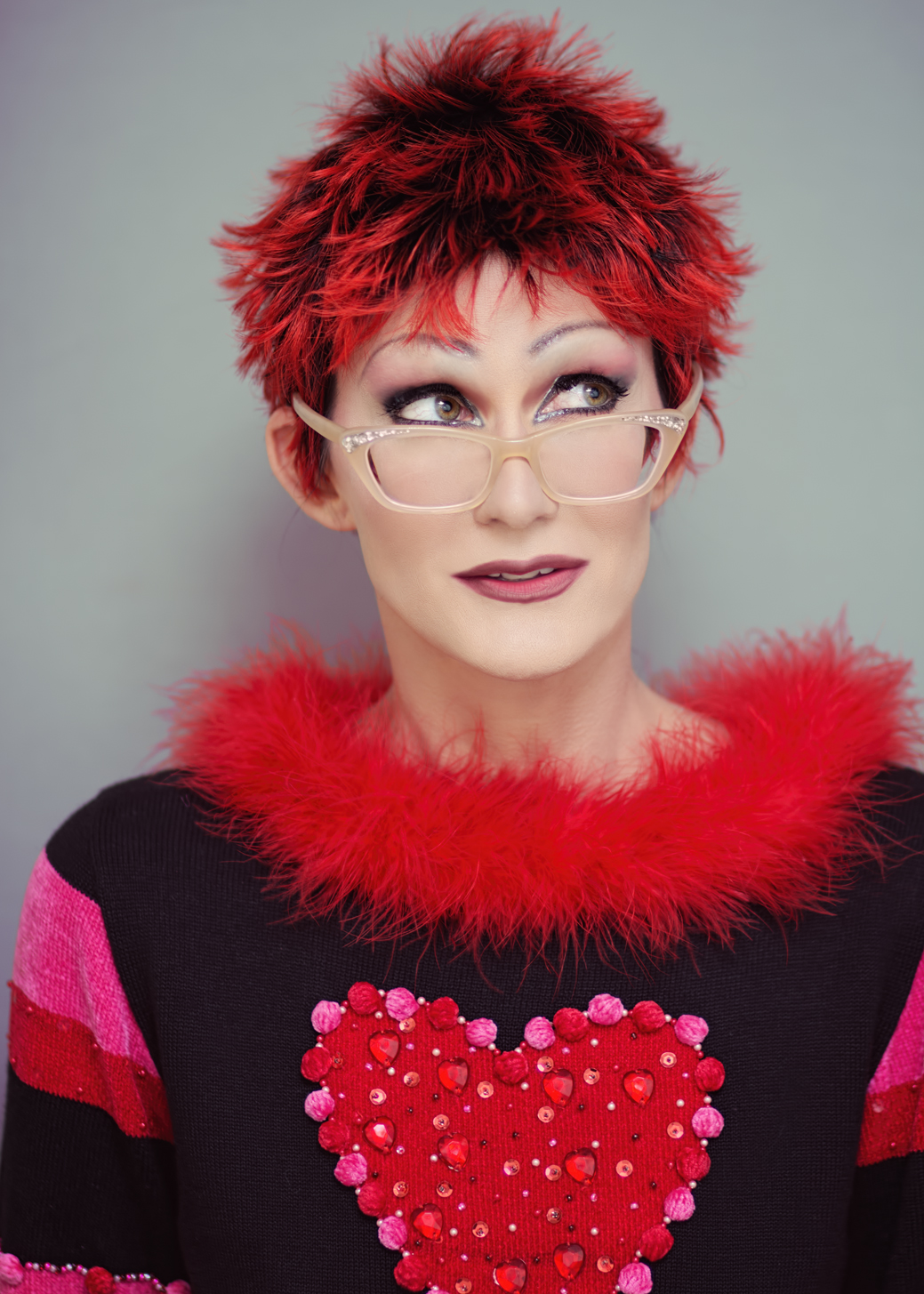
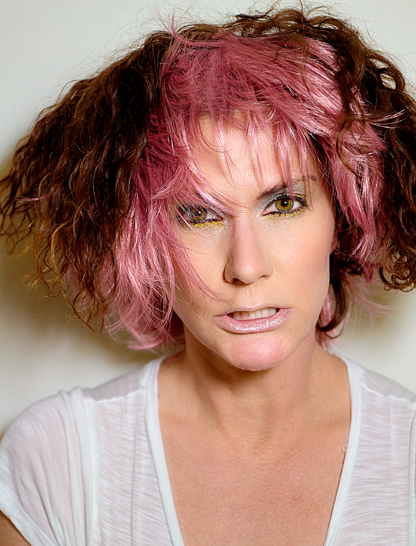
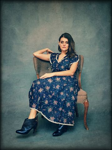
This one worked out better; I wasn’t using the softbox when taking the picture, so you can see how much softer and more dimensional the face looks from the start. Also, in case you’re interested, that dress was actually a mauve color that I edited to look gray; I didn’t really realize it when I chose the dress to go with that wig (I really chose it because I ran out of my usual photography makeup and was trying to find something that would cover me all the way up to my neck; in photos I use makeup on my neck and decollete that’s a different color from what I use on my face to get a good match, but I ran out on the last shoot and forgot to buy more) but when looking over the shots I noticed that the white curls on the wig mimicked, at least to me, the flowery swirls in the lace on the dress, so I wanted to emphasize that more by making the dress the same color as the dark black hair on the wig. Black was a bit too dark, though, because I also wanted some of the shine from the material to show, so I went with a dark grey. The result was a much more unified and interesting photo.

lighting5

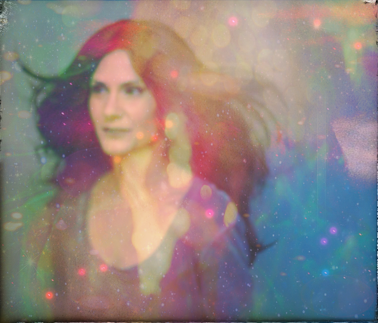
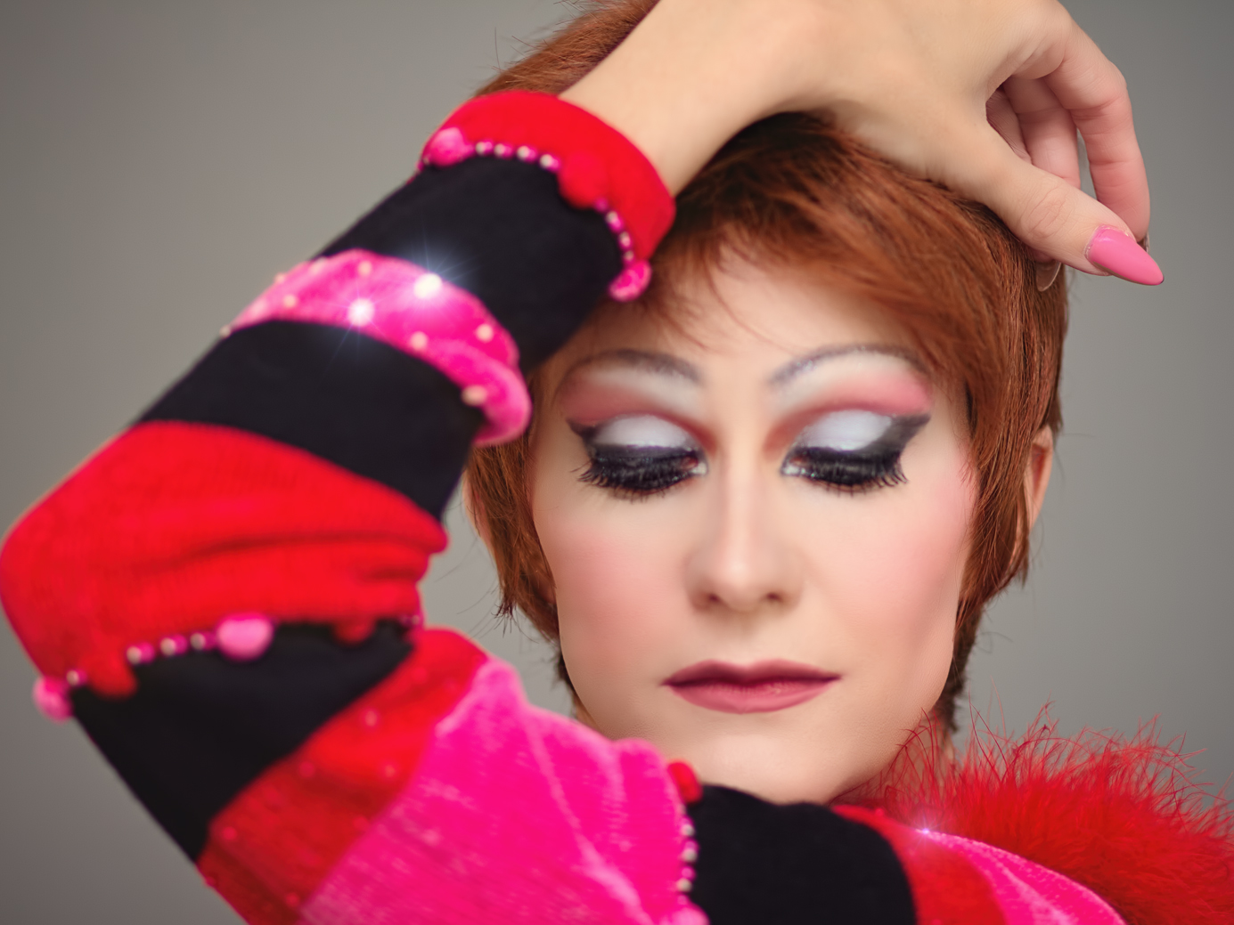
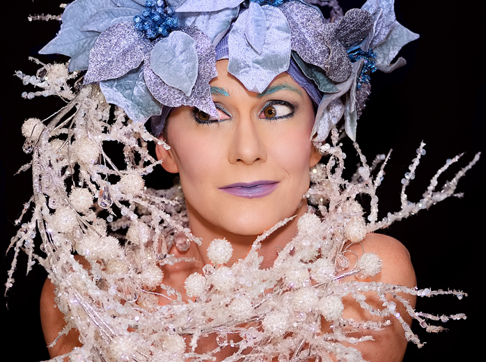
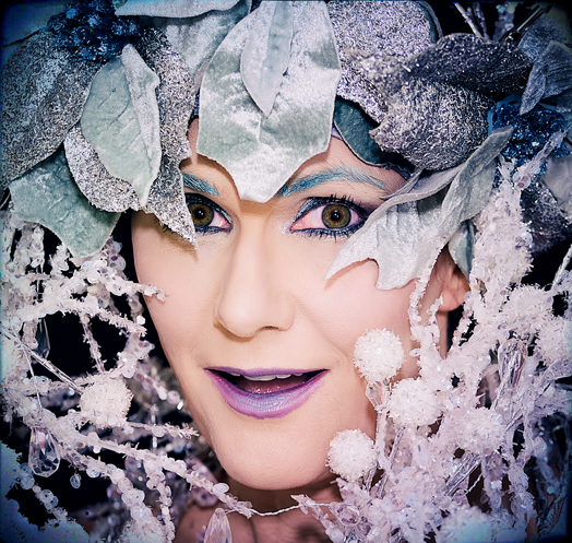
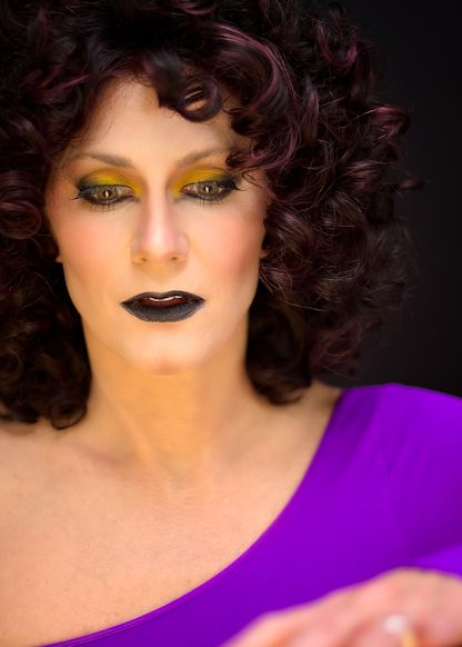
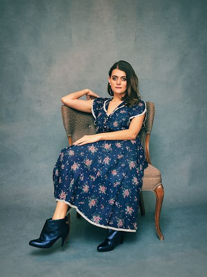
In this shot I was once again using different lighting, but I think I did better at editing the skin even though it’s probably a bit TOO alabaster-looking to be considered real. However, I think that works with the dress and the hair anyway so I’m fine with it. And although the dress color in this shot was also edited, I went with more of a dark blue this time than gray. I’ve also been continuing to mess with the face sculpting controls in Portrait Pro to alter my look; in some shots I still look like me albeit a much better, less-wrinkled version; in others I let Portrait Pro edit me until I was practically unrecognizable. I usually use the program’s pre-sets first and then, if I don’t like what I get, I go back and change things on my own – in this next photo, PP gave me a serious Angelina Jolie/Julia Roberts edit, and who was I to argue with that?

lighting4a

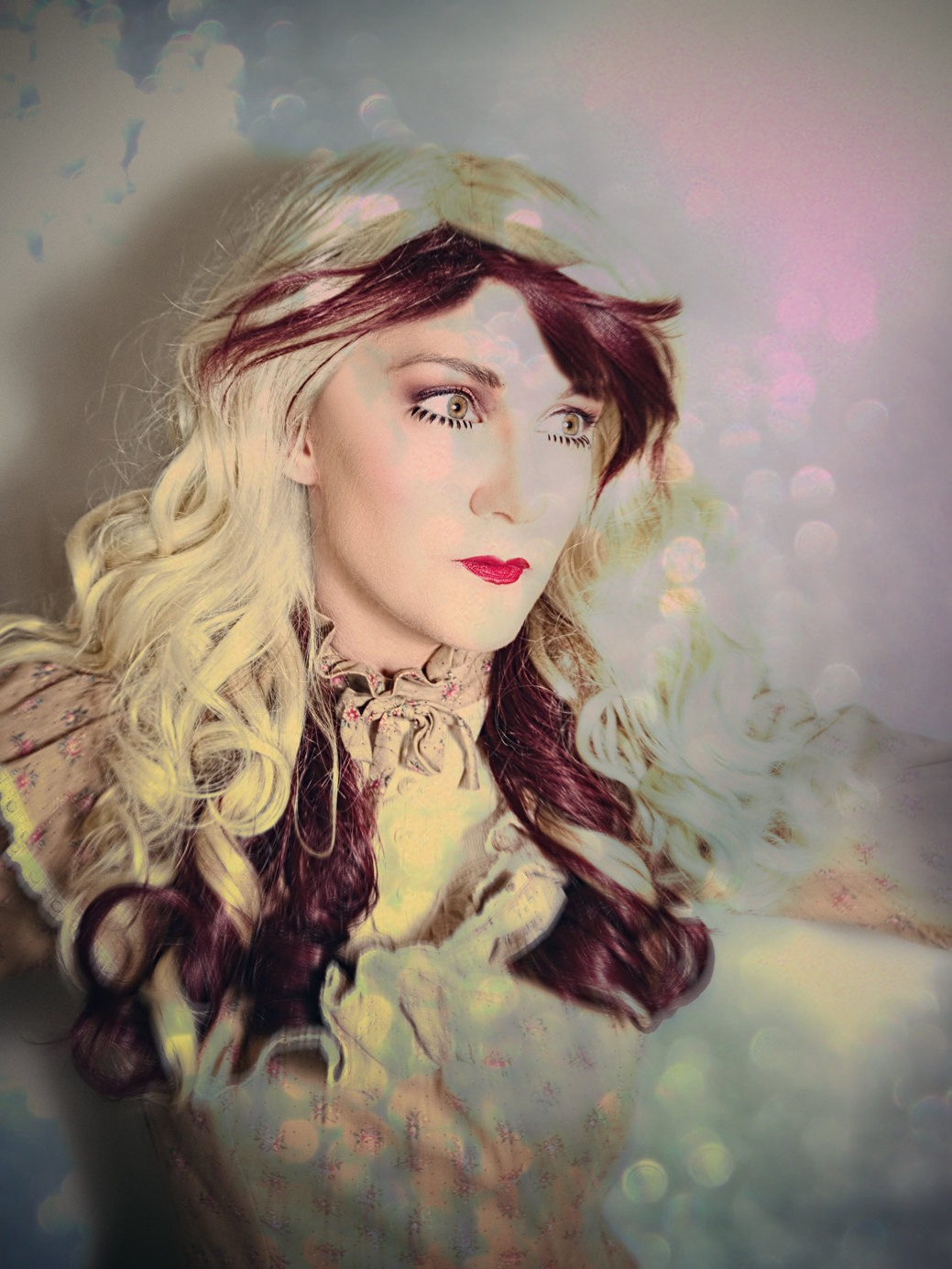
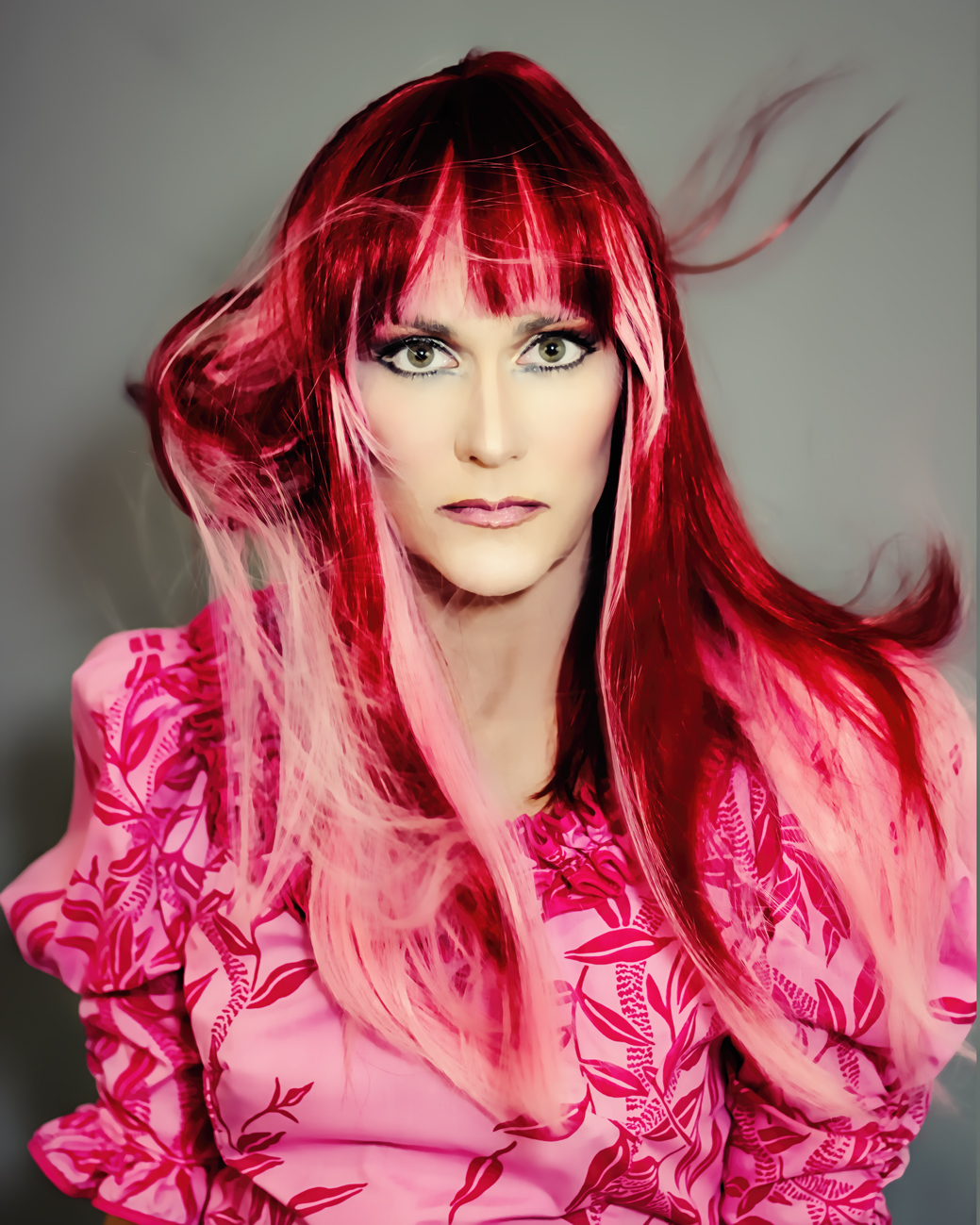
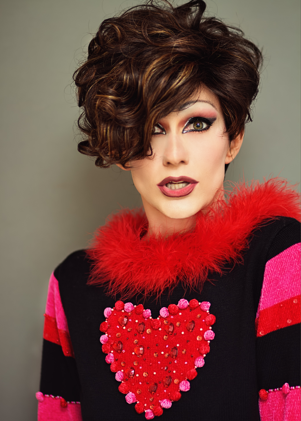
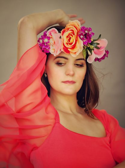
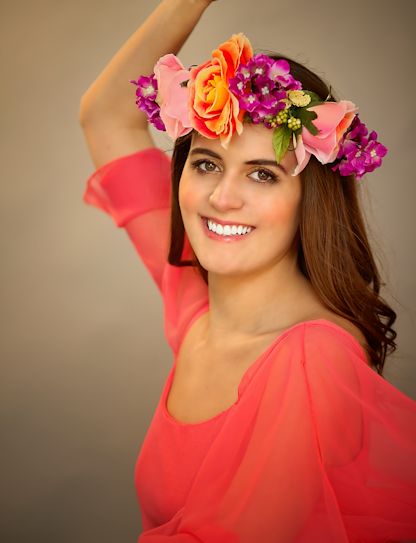
This is another one I shot using the softbox, so again you see how much depth is removed from the face when using it. Also, I thought this shot was going to be impossible to get right, because in the original my face was about 15 different shades (from not having my photography makeup again and improvising with my day to day stuff, which isn’t nearly as heavy in coverage) AND on top of that there was a big shadow on my nose from the hair blowing around that made it look gray. And yet I actually managed to salvage it, albeit with a TON of editing. The wig in this shot, by the way, is the Bennett I reviewed last week. This next one is another one of the wigs I recently reviewed – the Aria by Rene of Paris. It’s a gorgeous color to photograph:

lighting2ab

And yep, this is one of those shots I felt I over-edited then added a bunch of texture to try and conceal. My skin looks practically plastic in it, but I love the way the hair is moving and that color – it really can’t be said enough – is unbelievably gorgeous both in photos and in person. And keep in mind that in all of these five new photos, I was wearing the same makeup, and used Portrait Pro to make all the color changes. I can’t say enough about that program, if you love working with portraits it’s the best thing I’ve ever come across for processing.

Coming up soon – more photos, and of course, a few more wig reviews. I still need to film the Soft and Subtle by Gabor (a major disappointment, so stay tuned), a new Kristen by Renau in one of the new Chocolate Collection colors, the Tessa by  Noriko in Butter Pecan-R, and another Robin by Noriko in Harvest Gold (I’ve always wanted to see what a longer wig would look like in that color, and we all know I love Robin). So stay tuned! And for those who follow the private blog, keep an eye out for a new post there, too.

Plugged-In Christmas

redchina4a

Among other things, I treated myself to some new Photoshop plug-ins for Christmas, and I’m having a hell of a lot of fun trying things out.

redchina5abc

The frames feature is actually my least favorite aspect of Mister Retro’s Retrographer plug-in; most of the frames chop the hell out of the photo to fit it into the frame, which bugs me to no end. But, many of them are pretty convincing (the one I used above is cheesy, but they have a bunch that are cool):

skintest2a_RR2

Frames aside, I am enjoying all the options Retrographer offers me as I was getting bored with the software I’d been using steadily for the past year and half, so I’ve been going processing-crazy with all the new bells and whistles.

skintest4_RR

This has also allowed me to dig back into past archives, work with old stuff, and see it in a new light (by filtering the hell out of it, of course). As a result, I haven’t taken any new photos, because I’d rather just sit down at the computer and play with my new editing toys than spend all day doing a shoot; but with thousands upon thousands of photos to choose from, this is hardly a problem – especially since I get bored with photos from the same set quickly and end up overlooking a lot of good shots.

skintest3_RR

I also bought a program called Portraiture, which focuses on correcting skin tone and texture – one of the aspects of portraits I am the most picky about, and often the most dissatisfied with in my own photos. Early test results are promising, but as usual I tend to get too heavy-handed with the smoothing and look a little too plastic, at least when first learning something new. Still, even for plastic results, these are better than I’ve been able to pull off up to this point:

skintest1

Once I had a feel for the Portraiture plug-in, I started going to town with the Retrographer effects and used WAY more processing than I’ve done in quite awhile:

RR_collage_1

RR_collage_2

While going through old photo sets for stuff to play around with, I came across this idea I’d had a year or so ago, where I would throw clothes into the air and shoot it in motion, then composite it into a shot of me with clothes flying around me. At the time, I didn’t like the shots of the dress I tossed around and didn’t pursue the concept with my final shots; but this time, I decided to give it a go. Although i still struggle with shadows when it comes to creating composites (a skill that is made more difficult, I think, by the fact that I shoot against solid backgrounds rather than shooting with a set behind me – the shadows’ imperfections are much more obvious against a solid gray background than they are against, say, a grove of trees) I am definitely better at it than I was at the time of the original shoot, and the fact that I still really struggled with it may have been why I didn’t pursue it at the time. In fact, when i took the photos, I think I was still using Corel Paint Shop Pro as my main editor and barely knew how to use Photoshop at all.

So – I took one photo of my body as the main photo, took a second photo of myself and layered my head from that shot onto the original since I was making an unattractive face in the original, then composited two shots of the dress in motion into the same shot, with them flying above my head to fit into the frame (and no, I don’t think “composited” is a word, but I used it anyway). I then pulled the whole thing into Retrographer and used a lovely film filter than took my background from gray to purple and really brightened the pink of the dress, and topped it off with some subtle pink lens flare. I am pretty thrilled with the results, and this has to be a favorite of anything I’ve done recently (this and some of those red dress shots, like the first one in this post):

oldleap1_RR_notexture

Ain’t technology grand? Just when I start getting bored with myself and what I can and can’t do, along comes some new stuff to revitalize me all over again. I’ll probably have more to share later since I’m working with pictures at least a little bit each day right now. I also have some plane pics to share from my recent outing with my father, which wasn’t much of a success due to bad weather and poor camera settings I forgot to check, but I managed to snap a few. One more week of vacation before the insanity starts up again, so let’s get to it!


Drag Days of Summer, Part Two

OK, here we go with the actual photos! The ones I’ve had a chance to edit, at least, from Wednesday’s shoot. But first:

skirt3a

I actually have some shots to share from June that I never posted. First up is a few more with this fab striped skirt I got from The Gap – it really photographs well!

gapskirt1b

That was actually what I call an “unjump,” meaning an attempted jump shot that I timed wrong and did not capture properly. Both the unjump above and the next one are also composites – the top half of me is from one shot while the bottom half is from another:

skirt2a

In both cases, I just didn’t like something that was going on in the top half (I think in one my hair was completely covering my face and in the other I just didn’t look too graceful) so I did my best to layer two different shots together. Took a long time, but I think I pulled it off OK.

Also, not gonna lie – in the shot directly above, the shadows were hitting my face in an unflattering manner, causing my nose to look unnaturally big. So, I used Photoshop to make it thinner. Then, I realized my eyes looked wonky with the thinner nose, so I worked some more magic to move them a leeeeetle father apart from each other, and thus  balancing them with the nose. Have you ever heard how if you try to get plastic surgery on one part of your face, you often have to alter another to make it look right? Well, that’s kinda what happened here, only, not permanent. Still, in the end I look a bit less like myself than normal, but whatevs. I already had a torso from one shot and the legs of a different one, so why stop there, right? Moving on.

Here’s another shot I took of Robin when I was messing around with her after making my video review:

Robin3bb

As in the last shot I shared, this one is also two different pics of the wig combined to give it more interesting movement. And lately I’ve been experimenting with some softer light filters than I’ve ever used before; I’m in a phase of feeling less insistent on absolute clarity and trying out softer looks. Who knows why. Always something to change up.

Brandi1

This is a shot I took of Brandi during the same shoot where I took the Robin pics (obviously, since the clothing is the same). Brandi is much more full, so I didn’t need to layer two photos together to get that much movement. One more from this set, this time ridiculously Pixlr‘ed:

Brandi2a

The original pic was out of focus, but I really liked how it looked in spite of that; there was a really nice shape to the flowing hair, so I chose to work with it anyway. I think I may have over-done the Pixlr overlays, but they have added so many cool ones lately I kind of can’t stop tinkering (I love the ‘mermaid’ and ‘candyminimal’ ones in particular). Speaking of overdoing it with Pixlr:

dolly1aa

I’d really started to get bored with June’s shots by this time, and dug back into the ol’ archives to find something else to edit. In the end it felt a bit boring, so I ran it through the Pixlr grinder also. Another old one I worked with that I did NOT Pixlr-fy was this one:

pink1a

That’s one of my favorite photo wigs, even though I tried to trim the bangs myself and really jacked them up. Not too noticeable when I’m throwing the wig around, fortunately.

Okay, so now on to the most recent stuff:

heart1b

I already mentioned the makeup process I went through for this shoot, so can we talk about this sweater now? I got this from my favorite online store for vintage costume-like goodies, The Kissing Tree. Whenever I’m feeling a little bored with my current stash of costumes I go check them out (usually at their eBay store), and when I came across this thing I knew I’d found my next purchase. It is perfect for portraits because there’s so much going on, it can be used in many different ways even within the same shoot without it really looking like it’s the same sweater every time. It has a great feathery collar, and I love love LOVE clothing with texture; the sleeves are not only striped BUT they have little fabric balls AND beads AND rhinestones – fabulous! Just moving my arms around in interesting ways make very unique pictures – like this:

heart7

Then, for added fun, it also has that huge heart right in the middle. I didn’t actually use this sweater in nearly as many ways as I could have in this set, but I love any article of clothing that lends itself to a lot of different looks just by positioning the body in different ways. And at $34 it was a steal. The only downside is that it’s a sweater, and a heavy one at that, so for taking photos under bright lights in July in a small studio with tons of windows, it can get pretty hot, but I just stuck on some shorts and did the best I could – most of the shots I took were portraits; I spent two hours on that makeup and I was determined to get the most out of it! So for most of the shots wearing shorts that in no way matched the top was fine.

To maximize the shoot, I also made as many wig changes as possible:

heart3a

See what I mean about that sweater? This photo doesn’t even look like it’s from the same shoot! And there’s that softer lighting again. One thing I did differently this time was really neutralize a lot of the color in the RAW files so that I didn’t get some of the blown-out brightness and discoloration I tend to get when processing, but I think that resulted in my face looking too white later. That, and the fact that I used too much highlighting on my face when applying the makeup. Anyway, that led to me having to add some detail into the shots using shadows and filters, and I think I leaned towards softer light effects to help soften the face overall. If any of that makes sense. Also, my blending wasn’t great so I spent a lot of time smoothing out that eyeshadow, and I messed around with my nose a lot in most of the shots. I found that enlarging my nostrils just a bit really changed how I looked, so I did a lot of little tweaking like that here and there just to accentuate the drag-effect I was going for. Kind of the same technique I used for this one:

heart10

My face came out REALLY white in this one so again, the softer light helped to add some dimension and detail back to my face. And who knew that Rene of Paris Caitlyn would make such a great photography wig? I almost sold it, but in the end I decided against it because t was inexpensive and I thought it MIGHT be good for photos – that sure was a good call, because I LOVE how it looked in this set. I’ve been gravitating towards short wigs lately for photoshoots anyway, especially when I’ve just spent two hours on my makeup; they are so much easier to work with when posing, and they stay out of the face. I can’t get all that good flowy motion I love, so there’s always a tradeoff, but especially with the summer heat the shorties are definitely a good option to have.

They don’t look as good for jumping, though,but it was pretty hot in the sweater already so I stuck with Caitlyn for my leaps – which really weren’t leaps but levitations:

heart4c

For this one I was leaning over a stool, then I layered that over a blank shot I took of the background so I could erase the stool out of the shot. This was mainly tricky because of the hand I was leaning on in the original:

heart4a

That hand was a real giveaway; it did not look at all natural when I was “floating” and made it obvious I’d been leaning on something, so I went back to my other shots from this point in the set, and found a hand I thought I could layer over the original one. However, THAT hand had all my fingers spread apart, and it was an absolute bitch to essentially cut and paste properly without the edges of the fingers looking really unnatural and obvious. I am not sure why it took me so long to give up on that hand and just go find another one; I think I spent something like four hours working on this photo and a good two of those hours were dealing with that stupid hand! In fact I gave up for the night eventually and returned to it the next day – at which point the solution became obvious, which was, duh, go find another hand.

Funnily enough, the hand I used ended up being the original hand from the next shot I processed; I didn’t notice that until I was editing this shot and working to erase the stool and had to maneuver around the hand again and thought, hey, this is as easy as it was working with that hand in my other shot – oh hey! It’s the same hand! Hi, Hand!

heart8

So now you can scroll up to the first levitation shot and see the same exact hand in that one as is here. Isn’t that completely uninteresting? And aren’t you glad I spent an entire paragraph and half talking about it? Of course you are. And in this shot, I was once again posing on a stool in the original, and used the same blank backdrop shot to layer over. My lips were also wonky in the shot, and in trying to fix the wonkiness I made them huge, then decided I kinda liked how they looked and kept them. Oh, and shadows. They’ve been a bitch for me ever since I started trying to edit them into levitation shots to make them look real, and I finally figured out a strategy that works for me. Instead of using the burn tool with a fairly small brush and drawing an outline around myself, I just make the thing HUGE and slap it over the entire subject several times, then erase the shadows from my body and reduce the opacity, and BAM. A nice shadow every time!

In yesterday’s post, I mentioned that I was playing around with lighting throughout this set, too (remember, I spent two hours on that makeup and was determined to get as many different looks as I could out of this shoot!). In most of the shots I had my Speedlight attached to the camera and bounced off the ceiling for some nice soft light, but occasionally I’d attach a light bender to it and aim bright light directly at my face for a different look:

heart2

Much harsher shadows behind me, and a lot less shadows on my face with a much brighter light. It’s a harsher look, and overall I don’t care for this effect as much as I do the softer ones, but for something different it’ll do.

And to sum up for now (who knows how many more of these I’ll edit – I have a few wigs and looks I haven’t even processed yet) here’s one last wig change:

heart9

That wig is called “Sava” and I think it was made by Vanessa Wigs. I’ve gotten more photographic use out of that $20 wig than many of my costlier ones; it’s interesting, it’s easy to wear, and it works with so many different looks, believe it or not. Great wig. And those are some older Zenni Optical glasses I got and kept even though they are no  longer the right prescription, because they’re awesome.

Whoo I am all out of words! Which is great, because I’m also all out of photos for now. More to come though, as well as some new wig reviews: Camille by TressAllure (which is really Shilo by Noriko, but with a lace front); Miranda by Amore; Stevie by Amore; Kenzie by Noriko; an updated Code Mono by Ellen Wille; a Seville in Macadamia-LR by Noriko; a May by Noriko; and another Noriko Angelica (also in Macadamia-LR). Sheesh, did I really just admit to buying all of those?! As I may have said before, it’s my birthday this month, so I partied it up a little early with my purchasing. School starts in two weeks anyway, and I know my wig reviewing will either calm WAY down or possibly grind to a complete halt, so I’m getting it all in while I still can! Never fear though – I still have oodles of old vids to upload, so that should continue to either annoy or entertain you through the first semester, at least.

Oh and also – my July Stitch Fix will be here Wednesday, so that’s happening too. What can I say, folks – stay tuned!

Peer One Portraits

Stupid title, but it’s a play on Pier 1, which is where I got all these props. Moving on.

Pier6_final

My initial plan was to wear one of my silvery gray wigs in this getup, but it ended up getting tangled in the garland so I put a thick silver headband on my head, on top of my wig cap, and pinned the poinsettias to that instead. Ended up working out great; I forget how much more difficult long wigs make taking self-portraits. They’re a bit hot under the lights, they get in the way constantly (snagged up in the costume or in my eyes while I’m trying to see what I’m doing or set up a shot), plus they tangle a lot when I’m flinging them around. Believe it or not, having 4 poinsettias clipped to my head was actually easier than putting on one wig! And yes, the poinsettias came with clips attached – I’m sure they are meant to clip to Christmas tree limbs or something, but that’s why i snatched them up, because I knew they’d be super-easy to pin to my head. And they were, except on one of them the clip broke off after about 20 minutes – kinda chintzy for a $5 decoration if you asked me, but then again, I’ve always found Pier 1 to be overpriced. Moving on.

Pier8_final

I was on my way to the register with some other stuff when I spied this white, sparkly garland shoved into a basket and snagged it instead. It was really fun to work with and created some very cool looks – the downside was that it was terribly itchy (then again, it wasn’t created to be worn by a human, so there you go). I loved the shots I got with these props, so much so that I’ve already edited – including the pics I shared yesterday – ten shots! That’s way more than I usually process from a shoot where I didn’t change costumes all that much. But the garland really added interest to the photos, and I found myself struggling to decide which shots to process.

Pier7_final
Remember when I said yesterday how I changed the colors up in every shot? Here I went for an icy blue that’s probably more green than I inteded.

When deciding what shots to edit, I try to find pictures where either my pose or facial expression isn’t so typical, but I do just have one face, after all, and I do tend to make the same faces over and over (which I discussed in a previous post). I think this is where the props can help a lot; to add some visual interest to the photo besides my face. I had very similar expressions going on in all the shots I took with the garland (about 200, in case you wanted to know), but the garland created a lot of interesting shapes and was fairly easy to manipulate. In fact, I totally want to work with it again – it’s very sturdy, and the wires are thick and strong so I can move it into a shape and it will hold it for several poses before it starts to collapse. I could have done a lot more, but as I said, it was terribly itchy and my skin was starting to get irritated, so I had to stop playing around. Plus, there’s only so many shots I need of me in this particular look with the same garland no matter how much I can manipulate it, so I figured I’d stop while I was ahead and leave more to the imagination for a future shoot where I can look completely different.

Pier11_final
Another favorite

As far as the technical stuff, to change things up a bit I used my 70-200 telephoto lens that I normally reserve for plane shots in this shoot. There was no real reason for this other than wanting to try something different and see how the photos turned out; it was nice to have more room to work with while I posed since I could keep the tripod pulled quite far back instead of needing to keep it closer with my 50mm or 85mm prime lenses, but I didn’t get the lovely focus and camera blur those lenses would have provided. Still, it did a good job and for the most part  the auto-focus was dead-on – easier than either one of the prime lenses, in fact, but I guess that finicky focus is why they create such nice portraits in the first place. Another benefit I’d never considered was that I could stand much farther away from the black backdrop, so there was very little light from the flash reflected in it to alter the solid black effect – another thing I probably should have known by now but never did.

Pier13_final

Because I used my Flash Bender on my Speedlite for this shoot, I got a lot of sharp, strong shadows that created some nice black and white shots as well, so there’s quite a few I converted to B&W when processing. I also kept my cheap ring light handy (and managed to knock it over and break it as well, so it’s time to buy another one of those) and for the most part had it set up behind me on a tripod to give my head and shoulders a bit of an outline against the black backdrop; occasionally I also placed it right in front of me to get some catchlights in my eyes. Unfortunately, in some of the tighter close-up shots the ring light tends to create a lot of chromatic aberration that I forgot to edit out (you can see it in the close-up shot from yesterday and the one above), and my eyes came out looking a little pink. I may go back and edit that before uploading to Flickr, but for the blog, pink eyes it is. And by the way, super-easy Photoshop technique for fixing chromatic aberration is located here – a two-minute YouTube tutorial that is simple as pie to do. Has saved my butt on many occasions when working with bright lights and getting all those purple rings around high-contrast areas.

These next few are pretty experimental and I don’t care for them quite as much as the more straightforward shots, but there was so much I wanted to work with here and I started feeling the need to change things up a bit.

Pier5_Snapseed

When this shot was taken, the Speedlite failed to go off, so the resulting photo was really dark. This happens several times throughout any shoot, and sometimes I try to process one of the pics to see if anything interesting can come of it. Usually nothing does, and I don’t think this one is very successful either. I pulled it into Pixlr to try and generate some added interest, and honestly I can’t remember what all I did to it there, but in the end, I still don’t think I like it very much. But hey, I tried.

Pier9_final

Mostly I just liked the way the garland was framing my face here; this is another shot I Pixlr’ed like crazy, but I think it worked better here. I used some of their graduated color filters as well as a space filter to make the costume sparkle; I just discovered that Pixlr’s desktop app can utilize masks so I was able to apply the stars without having to add them to my face, which is cool. I love textures and filtered effects, but for the most part I don’t like them to muck up faces, and it’s nice to be able to erase that out now.

Well, that’s probably all I have from this shoot, although I have one or two more I’m still eyeing. But I pretty much marathon-edited this weekend, partly because I had the time, and partly because it’s been a long time since I just worked with portraits and had forgotten how much fun it is. Busy week coming up at work – the week before any vacation is always stressful, and this one is shaping up to be the same, so I may be MIA until the holiday starts next weekend. Happy Monday everyone!

Bored-trait

Monday afternoon I decided to shoot some portraits and did a fairly quick makeup job to get some done. But I was terribly bored by the whole process, and less than thrilled with what was coming out of the shoot. So I decided to take my frustration out on my costume and photograph the destruction.

done1_final

That’s a wig I I cut a big hole in just to play around. Why wear them like normal when you’ve taken 8,000 + photos of yourself in them that way already? I’d also already seriously messed up my makeup by the time I took that shot, which was one of the last ones I took. Here’s a shot of the makeup before I destroyed it:

done3_final

The eyeshadow was all glitter, but it was a rush job so it wasn’t all that thrilling anyway. And that’s the wig with the hole already cut in, and my real hair sticking out of the top. I actually kinda liked the way it looked when worn like this. One thing I’ve decided I don’t  like, though, is shooting portraits against a white backdrop. I think I’ve mentioned this before, but it really does a number on my lighting and makes the colors weak. If nothing else, I need to learn some better lighting techniques when working against white. Working with gray or black backgrounds is easier for the type of portraits I like to shoot; much more dramatic results with better color and contrast. I am not skilled enough to know why, that’s just my observation.

Here’s one more, taken when I decided to rip into the black top I was using and just basically mess with it as much as I could beyond wearing it like, you know, a shirt.

done2_final

That would be me sticking my head through a sleeve, or attempting to anyway. My husband walked into the office at this point in the shoot and I told him I was attempting to give birth to myself through it, which made sense at the time. I still like the description, as it does rather sum up what I was trying to do. Without getting whiny about it, I’m bored again.

Even though I found the shoot frustrating and didn’t enjoy taking them at the time, I found some nice ones to process, and in looking at them now I’m reminded a lot of the old portraits I used to do, back when my camera was incredibly old and I had no lighting or backdrops or costumes or makeup skills, and my lenses were so crappy I couldn’t take anything but portraits (full-length shots were out of the question). Back then, I’d throw on a t-shirt and a wig and grab whatever was nearby and just make it work. And I’d keep shooting until I hit on something interesting, like ripping up a wig or a shirt, and I’d just go town with that idea. Part of the problem is I’ve done it all by this time (including wearing tops the wrong way and ripping up costumes, although ripping up a wig was new) and so I get less excited about doing it again. But some of the photos actually were interesting, so it wasn’t a loss even if I felt unenthusiastic at the time.

I did sign up for an online class to learn how to create composite shots the proper way; as educational an exercise as it may be for me to take a little photoshoot trip back in time, I also need to keep moving forward, and I just can’t get there on my own. I really want to create more whimsical and fantastical stuff, which takes me beyond what I can do here in my studio. I’ve reached a point where, without knowing more, I don’t even want to try, because I don’t want to deal with the frustration of trying to figure it out on my own. So I hope these classes can help with that. In the meantime, I may do more playing around with the simple stuff like I did here. The end results weren’t that bad after all.


Blue-Over

In keeping with my plan to tax my arm less, I only worked on a few photos today from my latest shoot. Since a lot of my work was focused on fixing some color errors in the photos I posted yesterday, I only have one new one to share today. But first – I went to lunch with a friend today (hi Mel!) and we stopped in at, of course, the one other Free People store that’s in the city. It was a really tiny little shop, but they had this one pair of shoes on display that for some inexplicable reason I thought were amazing – I say inexplicable because this is in no way a shoe I would typically wear. I say one pair because it was literally the ONLY pair in the entire store, and it just happened to be in my size. So here they are – they’re so ugly they’re rather awesome (I have a feeling a LOT of you are going to disagree with me on the awesome part though):

Photo Jun 29, 2 03 08 PM

Anyway, once the shoes were purchased and food was consumed, I got to work fixing the overly yellow tone to the photos I posted yesterday. What can I say, I got too involved in using the RadLab plugins and lost my head. After I posted here around midnight Sunday morning, I went straight to Flickr for my one upload of the day, and as soon as the photo hit my stream I realized I looked like some Victorian Oompah-Loompah – it was just way too much with the gold tones. So, I took that shot down and uploaded one that I felt wasn’t overdone, although it’s still a little yellow. Anyway, fixing this was a bit of a bitch, but on the plus side I did take some time to watch YouTube tutorials and learn how to correct white balance in Photoshop, something I did not know how to do previously. Still took some time with these shots, but I managed as best I could. Here’s the first one I fixed, original first and then the new edit:

victorian3_RadLab_DP

This was the one I first shared on Flickr then took down when I got a look at it lined up against other portraits on my stream. I had to see it in that context to realize how much I looked like an antique Cheeto here. After playing with white balance and some cool filters in Photoshop, here’s the updated version (I changed the texture on this one too, as the one I used above was also very golden):

victorian3_Snapseed_levels_DP

Soooooo much better, yes? The texture is really light here; I was torn about using any at all but I did want the vintage element it could add. I was unsure because I think the lighting on my face here is so nice, and I didn’t want the texture to muck it up. I ended up erasing most of it off my face, just leaving a little light mark here and there for consistency with the rest of the photo. You can mostly see the texture in the mirror and in the lower left-hand corner. It might actually be useless, but what can I say, I was nervous about going overboard with the filters again so I went really easy on them this time.

Here’s the other photo I shared yesterday that I also felt was too yellow, followed by the edit:

victorian2_final

victorian2_final2

It may have been because of the fairly weird lighting here, but I couldn’t use PS’s white balance tool to decent effect, and had to add a lot of blue filters in RadLab to cool the warmth down instead (hence my title, get it?). The lighting is so flash-y because I leaned forward pretty far in this shot, without thinking about how close it was getting me to the camera’s flash; even though I had it bounced off the ceiling my face got too close and blasted out a little by the light. I kind of like the effect that can have on occasion, and I think it works OK here, but it sure  made the shot a bear to edit properly, at least for me. I used the same texture on the edited shot this time, because I think the lightness of it worked well with the brightness of the shot and unified the lighting, in a way. I also added some shadows to my face, especially the eyes, so that it didn’t look as flat as it did in the first version.

Part of the reason I only had time to do one new one today is because this one was also a bear to pull off and took a load of time. I liked my face in this one shot, but as you can see, there was a framed picture hanging on the wall opposite the piano that was showing in the mirror, and the placement of the vase that rests on top of it was weird. So even though I liked my expression as I felt it was a little austere and unusual (which was in keeping with what I was doing in the shoot), it wasn’t going to work unless I got creative.

victorian6

Great expression, terrible background. However, I took a second shot like this after I took that picture off the wall and moved the vase, so my very next shot was much better. Except that I didn’t like my expression as much. There was nothing wrong with it, it just wasn’t as interesting.

victorian5

So hey, I thought, I know a thing or two about a thing or two, maybe I could take my head from photo one and create a composite with photo two to get the right face into the shot with the right background. This is where YouTube came in handy again, because one thing that’s eternally tricky about composite shots is that each shot you take will have a slightly different color balance, and if you are going to take your head off one shot and try to paste it onto another body, your skin tones damn well better match exactly or it’s going to look weird. Which rarely happens right out of the camera, and often causes problems for me. In truth I have to abandon a lot of composite shots because I can’t get the colors to match perfectly, and where I’ve layered one shot over another even the slightest color imbalance will show and screw it up. But when watching the tutorial about adjusting color balance, the video went on to show how you can take the color balancing you just did to one photo, save it as a color profile, then open up another photo from the same shoot and apply that same color profile to it for a pretty close match, if not an exact one. I knew this was possible, but had never bothered to learn it before – it worked well here, and although it did not provide a total match, it got me close enough. So here’s the final composite shot, with the face of shot one and the rest from shot two, as well as some blue filters to cool it down a bit and a little texture added:

victorian5-6_final

I think the shot’s a little crooked, actually, so I may go in and fix that, but other than that I quite like this one. And by the way, I never noticed before that I have Stephen Colbert ears (one sticking out far more than the other). Ah well. I don’t know how many more of these I can edit since this is pretty much the gist of the shoot at this point – me looking austere sitting in a chair or in front of a piano. There’s only so far I can go with that…but I like what’s come out of it so far, and the things I’ve learned while working with these. I certainly got more mileage out of this shoot than I thought I would.

Portrait of a Shady Lady

I only titled this post as I did because while working with a few portraits I snapped during Saturday’s jumping shoot, I played around with light and shadows using the burn tool some more in Photoshop. I’m not really shady – except for the shadows previous sun damage is adding to my skin, but I’ll discuss that later. This post is also a random rambling of ideas that have rolled around in my head while editing these photos, so it kinda goes all over. Let’s get to it.

fp6_Snapseed

I didn’t actually play around with the burn tool until the last photo I’m going to share though – as I mentioned last time, it’s a new tool to me so I often forget to try it out on my photos. Part of the reason for taking these shots was initially just to test out my lighting and custom white balance, as well as doing a quick makeup check to be sure my eyebrows were dark enough (they tend to disappear) and my contouring didn’t need better blending (it didn’t). I always take test shots of these things and usually end up with at least one I want to process. This time I thought I could use the opportunity to show my hair length, since I’ve talked before on the blog about how long I’ve been growing it out.

RAMBLE #1: I don’t know if you can really tell here, but I haven’t had a hair dye touch-up in 3 months, and my roots are really starting to show in natural light. However, I’ve decided to stop coloring my hair, so there’s gonna be a bit of an awkward look to it for quite some time. I don’t think it’ll be too bad, because I’ve kept the haircolor as close to natural as possible, but my natural hair is both a bit darker than the dye job (which starts out a match but tends to lighten as the weeks go by) and a bit grayer. I have some silver in my hair but at this point cannot tell how much. We’ll see how gray I go as the months go by. I’m totally OK with this, and I do really like gray hair. Plus if I end up hating it it’s not like I can’t just dye it later. Mostly I am tired of the upkeep and just don’t want to stay on the hair-dye treadmill anymore, so I’d rather grow the gray out now when it’s sparse and isn’t such a stark contrast to the dyed hair. We’ll see how that goes, but I’m enjoying the little silvery bits I see so far.

By the way – a little side-note to these portraits is that I was actually still in my pajamas when I took them. I prepped for my shoot in the morning so I just left the jammies on until my makeup was done. If you scroll up to the first shot again, and look at the hot pink tank top under the cardigan, you can actually see a little spot of toothpaste on it. 😉 You have to look closely, but it’s there!

fp7_Snapseed

I had two umbrella stands aimed at my face here, each at a 45-degree angle, and my Speedlite in my camera’s hot shoe aimed slightly towards the back wall instead of bounced directly off the ceiling. I read somewhere that doing that would create better shadows, and I think it worked. I also think the ExpoDisc worked amazingly well here, and I loved the skin tones I got out of it.

RAMBLE #2: Another thing I’d like to mention is a little makeup tip for portrait photography: StudioFix Powder Foundation by MAC. I don’t use powder foundation on my face anymore as it’s too drying; but I’ve discovered that StudioFix in powder form is terrific at concealing the sun damage that’s begun to show on my neck and decollete (I went to the dermatologist last week for my yearly skin-check, and he confirmed that the redness and splotching I have now on both sides of my neck is sun damage, nothing else, and that there’s really no treatment for it. Oh well.)

coppertone-ad-1970-skin-tomorrow Ha ha ha NO.

To try and show what I’m talking about, and so you can see how well the StudioFix covers it up for photos, I took a quick pic with my cell phone of my neck under normal light:

damage

It sucks, but it’s not the worst thing in the world, and for my day to day life I don’t give it much thought. But when editing photos, MAN can it be frustrating. I don’t have any examples because I’ve been using the StudioFix for a few months now and I’m not about to dig back through thousands of files to find older shots where it caused problems, but trust me when I say that I had to do a LOT of editing to clear that up for portrait shots, and it never worked perfectly – far from it. But the thing that amazes me about using the StudioFix is that I did not have to edit out any discoloration AT ALL. It completely conceals it. Interestingly, in real life, I sometimes take the time to apply the powder foundation on my neck and chest also (it stays well and doesn’t smudge onto clothing), and under normal daylight it doesn’t completely cover it (although it helps). I suppose it’s the matte nature of the foundation that makes it such a great barrier for photos though, or perhaps it just reflects light really well? For whatever reason, this stuff works. Instead of asking you to scroll back up and look at that shot of my neck again, I’ll give a comparison collage, but in this one, I didn’t do any editing at all to the studio shot, that’s straight outta the camera. Pretty amazing…I had loads of the stuff plastered on, and big old bright lights aimed at me, but still. I should probably start using the StudioFix on my face as well during shoots, but it’s just so drying on my already dry skin that I think it might cause problems.

damagecollage

Anyway, enough about sun damage and gray hair. Let’s talk about the burn tool in Photoshop. I decided to edit one more portrait and do a little comparison of it without using the tool and after using it; it’s definitely a subtle difference but it is there. You can use it to darken highlights, midtones, and shadows by creating a layer, setting the desired opacity level of the tool, and using it to “paint” the effect over the chosen area with a brush. I have yet to play around with the dodge tool, which works the same way but lightens those areas instead of darkening them; because of all the light I use in my little studio I tend to need to add more shadows and depth than I do light, but I am definitely going to play around with it next and learn to combine the two. Dodging and burning are tools that need to be applied subtly unless you’re really going for a funky look, so I’m not sure how obvious the difference is going to be here, but I like what I ended up with. Collage time (before burning is on the left, after burning is on the right – click the pic if you want a bigger version):

FP_port_collage

The highlights on the left were just a little bright (burning highlights is really tricky because they can easily go flat and gray, so I was only using about 3% opacity for it), and the shadows on my face in particular lacked a little depth. Without making any obvious changes, I think the shot on the right has just a bit more color in the face and a little more detail. Every little bit helps!

May Madness

I have taken a LOT of photos this month, y’all. And since I’m actually writing this post while it’s still May (even though it won’t  post until June 1), let’s continue to look at them.

daft4

In this one, I was actually trying to hold up my huge light reflector, which was flipped to the gold side, but I thought it kinda, sorta, maybe looked like I was conjuring up a fire or something. You know, with my magic powers. I’ve got a terrible hot spot on my nose here (a bright blast of light, not something gross if that’s what you were imagining) and I really hate hot spots, but I couldn’t get rid of it effectively so it stayed. You can see the warmth of the reflector a little bit here, but it didn’t work all that well with my studio lighting and without a stand (really need to get one). Moving on:

daft6
She’s got stars in her…mouth?

The stars are actually on a black headband that I edited out of the shot; I think it made my jawline a little wonky where I had to edit but I doubt anyone else will notice.

The last shot I have to share is one of my makeup/lighting test shots. I always take test shots as I apply my  makeup to be sure everything is going according to plan, so there are all these shots at the beginning of a set with me in various stages of photography/drag makeup. And as you know I usually find at least one of these test shots interesting enough to edit since I end up making strange faces in them and just generally looking bizarre.

daft5_Snapseed

I liked this one OK, but on it’s own it seemed a little dull, sooooo you know what I did next:

daft5_Snapseed_pxr
Pixlr, of course

I played around with light and lenses throughout the shoot, so I used different lenses for all these shots: the first one was with the 50mm, the second was the 85mm, and the test shot was taken with my 17-40mm. I also used an on-camera and off-camera Speedlite, with the on-camera one shot through a softbox so I could hit my face with a lot of diffused light.

Oh, and I also did something I almost never do while shooting: I listened to music. Usually, as weird as it sounds, I use session time to catch up on TV and movies I might want to watch, then I only half-watch them while I’m working (which is why I never know what’s going on plot-wise with the shows I do watch, annoying but true). But CocoRosie released an album earlier in the year that I never got around to listening to, and I enjoyed it so much I ended up dancing around in front of the camera. Sadly, much like random jumping without planning and preparation rarely results in a good jump shot, neither does random dancing about result in good ‘dance’ photos. I mostly looked like I was having a seizure, so none of those will be processed. I need to stick to carefully posing my dance shots if I want them to look like anything remotely graceful. But I had fun taking them, at least, and got in a little exercise to boot.

Stripe Jumps

As I mentioned in my last post, my foul mood over losing out on plane spotting this weekend was partly alleviated by getting dressed up a bit and taking some photos in my little studio. Always good for getting me out of a funk.

I didn’t bother with too much studio makeup, just put on enough to make my features stand out in the photographs as I was in a hurry and also wanted to snap a few pics of a new wig for a blog review over on RLW. Here’s one quick wig snap, since I took them at the same time:

Mila1

Can you believe that thing was $230? What a mess! Not that I paid that much for it, but still. It’s pretty awful. However, my Photoshop skin-smoothing skills are getting pretty awesome – check out a little B & L:

Mila2_Snapseed
Before
Mila2a_Snapseed
After

Still me, just a little better. And it didn’t take me all day to do this, and I didn’t have to go view the video tutorials a thousand times to pull it off, so yay for that. And now on to the jumping, which also involved a little photo editing magic:

MilaJump3a_pxr

This one, I think, is the best I’ve edited so far – mostly because I got the technique down by the third photo and didn’t feel like going back and re-editing the first two. I was actually standing on a wicker ottoman here that I covered with a black blanket, but I also took a background shot of the black backdrop and then pasted this photo over that background as a layer, and then erased the stool. I think this photo is the most crisp and clear, and in spite of the fact that I pretty much hate that wig (it’s the new one from the portrait posted above) it moved well and looked good for the photos. Doesn’t make it worth $230, but still.

I edited this one using the same basic technique, but here I used the photo of me on the stool as the background, and made the photo of just the black backdrop the layer I pasted over it – I don’t think this worked quite as well:

MilaJump2_Snapseed

It’s not bad, and it could be that the movement of the first photo is what makes it more effective, as it really looks like I’m doing some sort of weird squat-jump in that one while here it’s more obvious I was standing on something that got edited out. But working this way, rather than trying to cut myself out of one photo and paste myself onto the backdrop shot, eliminated at least some of the issues I was having before with shadows, and I didn’t have to totally re-create them this time. Also, this black backdrop creates one hell of a vignetting problem when editing and I’m not sure why that is; I feel fairly certain no one else cares about the little color rings that form around the edges but me, but it bugs me to no end and always has. Not sure what to do about it, although for jumping pic #1 I did figure out to go into Pixlr and use one of their “smoke” borders to conceal it a bit.

Also, that dress, which I’ve had for a couple of years now, is amazing for jumping and movement photography! It’s been hanging in my costume closet all this time, and although I’ve used it twice already, it’s been a long time since I’ve put it on, and I hadn’t thought of using it again until recently – my parents have rented a beach house for this coming weekend, and I am going down there Saturday, so I’ve been thinking about bringing this dress to use for some shots on the beach (either myself wearing it or someone else). When I decided at the last minute to take some movement photos, I guess that’s why it sprung to mind, and I’m glad it did, because it reminded me how great this thing moves. And to think I bought it at some fairly cheap clothing store while wandering around aimlessly, waiting for my nail appointment to begin – I bet it was $40 max if it was a dime. The only thing I don’t like about it is that it has one of those awful skirt linings that only comes to mid-thigh, making the rest of the full-length skirt transparent (God how I LOATHE this whole maxi-skirt-lined-only-to-the-thigh trend and want it to DIE already) which is really distracting in photos. So, I had to put on full-length black tights to conceal the lining a little, otherwise my legs would have shown through the skirt. Last one for now:

MilaJump1_Snapseed

My issue with this one is that the lighting and focus were off, and the subject doesn’t look as well-lit and defined as the other two. But that dress! It created such an amazing shape, I just had to process it. I actually went ahead and created a Pixler version too, and I’m not sure which one I like better. Perhaps you could view them both and then let me know:

MilaJump1_Snapseed_pxr


I was trying to detract from the fact that my face isn’t in good focus and came out kind of flat; but I’ve lost the attention-getting color aspect of the material, so I don’t know if this one is better or not. I’m now leaning towards the color one. Let me know what you think in the comments below!

More to come from this set, did some for-real jumping and may process one or two more levitation ones. And no, I haven’t forgotten about the aviation history museum photos, although at this point when I finally do upload them they’ll be anti-climactic.

Happy Monday everyone!